Introduction
Since the beginning of time, mankind has constructed fantasy worlds, and since the beginning of cartography, there have presumably been fantasy maps to go with them. However, in recent years, the field of fantasy cartography has seen a marked rise in interest. Nowadays it’s quite common for fantasy novels to include fictional maps of their stories’ settings, as seen in recent popular high-fantasy such as A Song of Ice and Fire by George Martin, Warriors by Erin Hunter, and The Divine Comedy by Dante Alighieri. Fantasy cartography discourse has proliferated on the Internet, and there are several online tools that procedurally generate them. The most popular is Azgaar’s Fantasy Map Generator, which was first published in 2017 and has received periodic updates since then.
With increased attention has come increased criticism of the fantasy cartographic industry – that the maps are too realistic, that they’re not realistic enough, that they’re too similar to each other, or that they’re unnecessary. I don’t really care about any of that, but I do think that they need better map projections. Thus, I’ve taken it upon myself to create a new fantasy world generator to rule all fantasy world generators, with which I will corner the vast and presumably lucrative market of procedural fantasy map generation and make all world-building Youtubers love me. I’ve dubbed it Dunier (pronounced /ˈdu·ni·ər/; it’s a portmanteau of the Old Pandunia words dunia, ‘world’, and -er, ‘artisan’).
Dunier is a pseudorandom algorithm that takes a random seed and a variety of input parameters, and generates a realistic fictional world, outputting a map of one of its continents as well as a factbook that describes the depicted countries in words. While no computer program can replace the joy and creativity of the entire worldbuilding process, Dunier can handle the parts that not all humans feel able or motivated to do. I’ve been developing Dunier since the autumn of 2019, and now, after six years of work, it’s finally presentable enough to publish! You can try it out by visiting dunier.kunimune.blog.
The purpose of this article is to describe how Dunier works in detail. First I will list the overall objectives I wanted to meet with this project. Then I will cover the algorithms used for the four main parts of the generation: planet, terrain, history, and map. Finally, I will discuss how I would like to develop Dunier in the future, and then conclude.
Table of contents
- Introduction
- Table of contents
- Objectives
- Methods
- Future work
- Conclusion
Objectives
There are several aspects of existing fantasy worlds and fantasy map generators like Azgaar’s that have always bothered me. First is the fact that, while most fantasy maps are ostensibly on round planets, and many encompass entire continents, few if any seem to know what map projection they’re on. When fantasy worlds are depicted from space, the map is usually simply superimposed over a picture of a globe or mapped onto it with a crude equirectangular projection. While I acknowledge that this isn’t terribly important for crafting an actual fantasy story, readers of this wobsite may know that I think map projections are neat, and so I think neglecting them is a missed opportunity.
Next is the names. Too often, fantasy languages are directly based on real-world languages (like how in The Stormlight Archives, Horneater names are based on Hawaiian and Herdazian names are based on Spanish). Again, this does not have much of a narrative impact in most cases (and may actually support the narrative if the author leans on knowledge of the real-world culture to help the reader quickly understand the fictional culture), but it impairs the culture’s ability to develop independently from its real-world counterpart, and can come off as offensive if done poorly. Even when fantasy languages are not based on real-world ones, their phonologies and syllable structures tend to resemble the author’s native language to an unrealistic degree. For example, in English works, dental fricatives (the “th” sound) are very common (think of Thaylenah, Tethyr, the Dothraki, or Kvothe) despite being quite rare in real-world languages other than English.
Many aspects of physical geography are also unrealistic in most fantasy worlds. Mountain ranges and island chains are often placed without regard for plate tectonics, deserts downwind from oceans, and rivers that bifurcate or cross continents. While I don’t intend for Dunier’s treatment of these features to be as detailed as some of the really hardcore world-builders like Worldbuilding Pasta, I do intend to put enough detail in my simulations to ensure that the basics are realistic to an untrained eye.
And finally, perhaps the novel objective of Dunier is that I don’t want it to just generate maps. A world is so much more than the sizes and shapes of its countries; it contains cultures and languages and history. And so I decided that Dunier will also output a PDF summarizing the demographics, culture, and history of each country on the map. In this area, it’s especially important that a computer program not seek to replace the human author, who will typically decide on features of the history and culture to suit their narrative vision. But much like the generated map itself, I think a random generation algorithm has great potential to give authors inspiration and help them produce truly novel ideas. And anyway, the author can always choose to ignore parts of the factbook that contradict their vision.
There are several common criticisms of fantasy maps that I do not intend to address with Dunier. In particular, much has been said lately about the inherent anachronism of a geographically accurate map of a premodern fantasy world. See, for example, essays by Jonathan Crowe (Refactor, 2019), Thomas Brodey (Tragedy and Farce, 2024), and Nakari Speardane (Nakari Speardane, 2025). As cool as it would be to make the equivalent of a T and O map for procedurally generated geography, it would also be really really hard. Thus, this is not a feature of Dunier. If you want a tactile or cosmological or just tastefully inaccurate map of the worlds Dunier generates, making it is left as an exercise to the user.
For similar reasons, I will be focusing on maps of large regions like countries and continents, rather than maps of smaller places like counties and cities. While I think a fantasy city generator would be another really cool project, it is beyond the scope of Dunier.
Methods
Dunier is a static browser-run webapp written in TypeScript using IntelliJ. It takes input parameters from the user and generates the world in several distinct steps. Each step is given a tab in the interface so that the user can try out changes to each step’s input parameters before moving on to the next step. First, a planet is defined in 3D. Then, terrain is generated onto that planet’s surface. Next, the rise and fall of civilizations is simulated for about four thousand years. Finally, the terrain and history information is represented as a map.
Planet definition
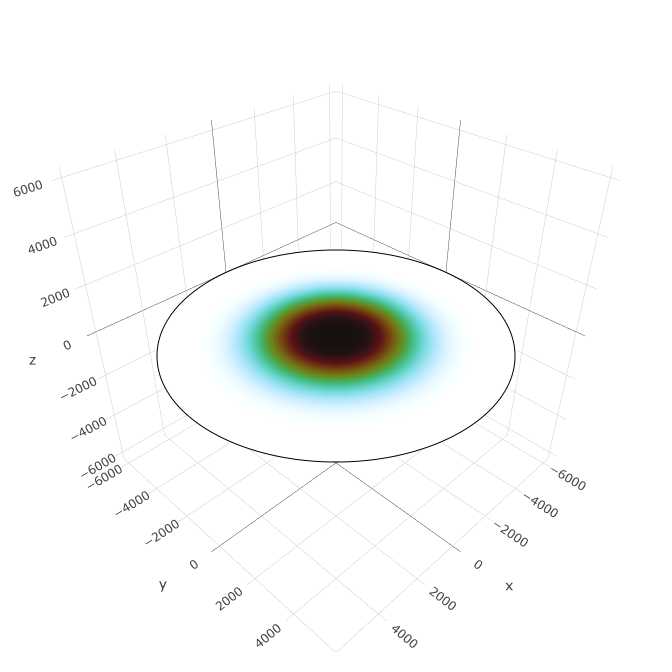
There are currently three types of planet supported by Dunier. Each is defined by a curved surface in three dimensions as well as two functions to define the climate: the annual insolation function, which defines how much sunlight each latitude receives over the course of a year, and the annual rainfall function, which defines how much rain each latitude gets on average.
Spheroidal planets
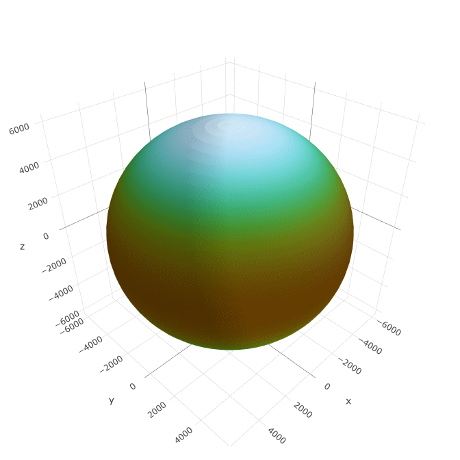
The first and most basic type of planet is an oblate spheroid, which corresponds to planets in real life. While we typically think of planets as spheres, in reality every planet is slightly compressed along its axis of rotation due to centrifugal forces. The resulting shape is well described by an oblate spheroid (a type of ellipsoid), defined by a radius R and a “flattening” f. Points on the spheroid in Cartesian coordinates ⟨x, y, z⟩ are defined according to latitude φ and longitude λ by the following equations:
x = R cos φ sin λ
y = −R cos φ cos λ
z = R sin φ (1 − f)
Dunier allows users to choose any radius for their spheroid (by default it’s set to 3190 km, half that of the Earth, since I think that sets a reasonable scale for a fantasy world). The flattening is then calculated according to the rate of rotation. Specifically, it’s calculated according to the dimensionless rotation parameter ω̃, defined as R⋅ω2∕g, where ω is the planet’s angular velocity and g is the strength of gravity on its equator. When ω̃ is small, the centrifugal force is weak compared to gravity and the flattening is near zero. As it increases, the flattening also increases, until around ω̃ = 0.5 where the planet will probably go unstable and tear itself apart. To determine the specific relation up until that point, I ran some simulations of uniform-density rotating bodies and fit it with the following polynomial:
f = 1 − 1∕(1 + 5⁄4 ω̃ – 0.019 ω̃2 + 6.142 ω̃3)
Note that this tends to overestimate the flattening because real planets do not have uniform density. For example, the Earth has a rotation parameter of 0.00343 but a flattening of 0.00335, rather than the 0.00426 predicted by this formula. But it’s close enough.
The normalized annual insolation s is a function of astronomical latitude φ′ (the angle of the north star above the horizon, which is slightly different from the parametric latitude φ defined above). It does not depend on flattening, but does depend on the axial tilt β. We can estimate it with this formula cooked up by Alice Nadeau and Richard McGehee (J. Math. Anal. Appl., 2021), which is based on the Legendre polynomials P2(z), P4(z), and P6(z):
s(φ′) = 1 − 5⁄8 P2(cos β) P2(sin φ′) − 9⁄64 P4(cos β) P4(sin φ′) − 65⁄1024 P6(cos β) P6(sin φ′)
Normalized annual rainfall is much more complicated; we use the following formula, which roughly accounts for the effect of atmospheric circulation cells.
r(φ′) = cos2 φ′ + cos2 3φ′
Tidally locked spherical planets
A special case arises when the planet is tidally locked to its star – that is, when its day is equal to its year. A tidally locked spheroid differs from normal spheroids in two ways. First, its rotation rate is negligible, so we set its flattening to zero. Second, the above formulas for insolation and rainfall no longer hold. For insolation, we can use the following formula instead.
s(φ′) = max(−2 sin φ′, 0)
Note that I’ve redefined latitude in this formula to be based on the sun rather than the stars. Now the north pole is the point furthest from the sun and the south pole is the point directly beneath the sun. Of course, technically the words “north” and “south” no longer apply so they would be called something more like “the sunward pole” and “the shadeward pole”. This is the coordinate system that residents of such a planet would most likely use.
For rainfall, we use the following formula. I have no idea what rainfall patterns would actually look like on a tidally locked world so this is a complete guess.
r(φ′) = ½ (1 − sin φ′)2
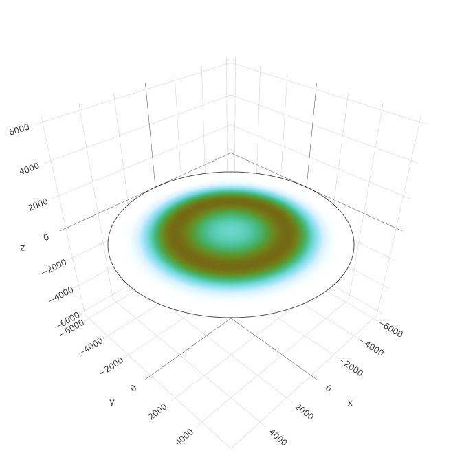
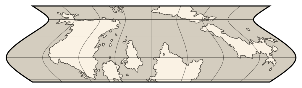
Toroidal planets
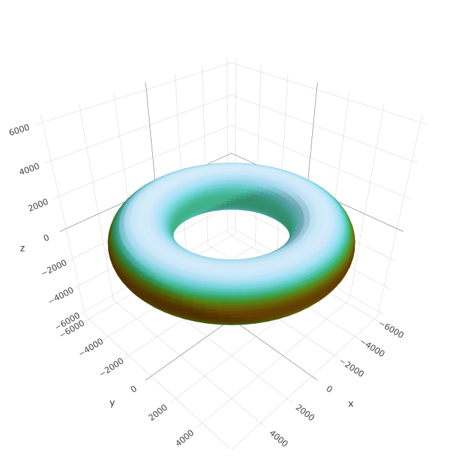
The next type of planet is a toroid. Toroidal planets are not known to exist in real life, but they’re theoretically possible and could be built by aliens as some kind of sculpture or gigantic fusion reactor. A toroid can be characterized by an outer radius RO, an inner radius RI, and a flattening f. The surface of a toroid is defined in terms of latitude φ and longitude λ by the following equations:
x = [(RO + RI)∕2 + (RO − RI)∕2 cos φ] sin λ
y = −[(RO + RI)∕2 + (RO − RI)∕2 cos φ] cos λ
z = (RO − RI)∕2 sin φ (1 − f)
It’s worth noting that this relatively simple shape formula is not exactly correct – a real toroidal planet would be more flattened on the inside than on the outside just due to the way the gravitational equilibriums are. But this captures the shape well enough and makes the math manageable.
To determine the relationship between ω̃, RO, RI, and f, I again ran simulations of uniform-density rotating bodies. I came up with the following polynomial fits:
RI = RO⋅[2∕(1 + 0.806 ω̃ + 0.991 ω̃2) − 1]
f = 1 − 1∕(1 − 0.929 ω̃ + 5.788 ω̃2)
A toroid is probably only stable for a limited range of aspect ratios (Andart, 2014), so I only consider this expression valid when ω̃ is between 0.17 and 0.50, where (RO + RI)∕(RO − RI) is between 1.5 and 6.0; outside of that the toroid will almost certainly fall apart.
The insolation on the outer surface of a toroid is exactly the same as the insolation on a spheroid. On the inner surface, though, you have to account for the slight reduction in average insolation due to the fact that the surface is sometimes shadowed by the other side of the planet. I did some simulations of this and came up with the following very approximate formula:
s(φ′) = ssph(φ′) min(1, ς)
ς = min(1, (1 − sin β)∕δ) min(1, (1 + sin β)∕δ) + 0.4 sin2(2 β)∕(1 + δ) − 0.8 (1 − f)∕α cos3 φ′
δ = 2 α∕(1 − f) tan β
α = (RO + RI)∕(RO − RI)
For annual rainfall, we use the same formula as for spheroids with no modification.
Because toroids have a minimum rotation rate requirement, it is not possible for them to be tidally locked.
Planar planets
The final planet type is planar. A planet of this type is a flat one-sided disc with the sun circling over the center. The radius of the sun’s orbit oscillates throughout the year according to a parameter analogous to axial tilt β, and has an annual average of R which is the radius of the “equator”. Gravity pulls down uniformly everywhere on the disc. This does not correspond to physical reality, but is rather based on the most popular modern flat earth theory.
The mathematical definition of this surface is trivial.
z = 0
The normalized annual insolation on a plane doesn’t have a nice Legendre polynomial fit that I know of, but I found the following fit that works decently:
s(φ) = 7.0∕[(3.865 cos 2β + 6.877) − (44.803 cos 2β + 1.216)⋅ρ2 + (87.595 cos 2β + 19.836)⋅ρ4 − (38.728 cos 2β − 8.049) ρ6]
ρ = √(x2 + y2)∕(2 R)
I doubt anyone has ever simulated the annual rainfall distribution on a flat world like this, so I used this formula, which roughly matches the distribution on a spheroidal world:
r(φ) = 3⁄2 sin2 2φ + 3⁄2 sin2 3φ − 3⁄4
Latitude here is defined based on the apparent angle between the center of the firmament and the horizon. Note that I’ve made the awkward choice to define it such that φ is always negative, meaning that the center of the disc is the south pole and the outer edge is at 15°S or so (depending on the radius of the outer edge). This differs somewhat from the modern flat earth theory, in which the north pole is at the center of the disc and the south pole is the outer edge. It doesn’t really matter as mathematically speaking both are equally valid. This just makes it more consistent with the tidally locked coordinate system – in both, the sun is overhead at negative latitudes and approaches the horizon as latitude increases toward zero.
Tidally locked planar planets
The final configuration is a tidally locked plane. This describes a flat world where, rather than circling the center, the sun remains stationary directly above the center of the disc. The phrase “tidally locked” doesn’t technically make sense here since flat earthers don’t believe that tides are related to gravity, but it’s analogous to a tidally locked sphere. The insolation of this world is:
s(φ) = −2 sin3 φ
And the rainfall function is this thing I made up:
r(φ) = sin2 φ
Terrain generation
Partitioning the surface into tiles
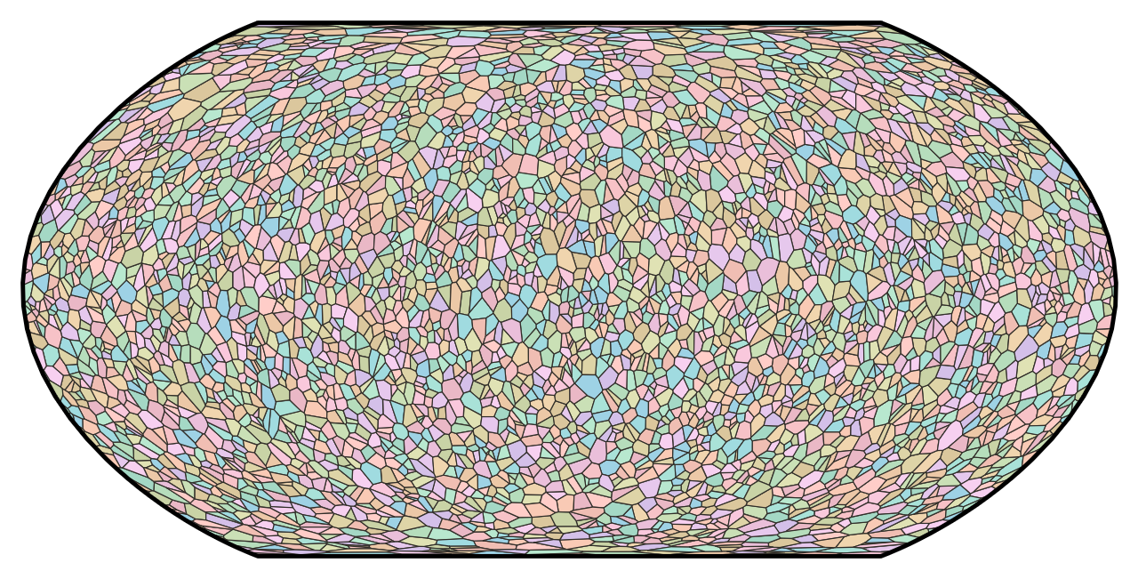
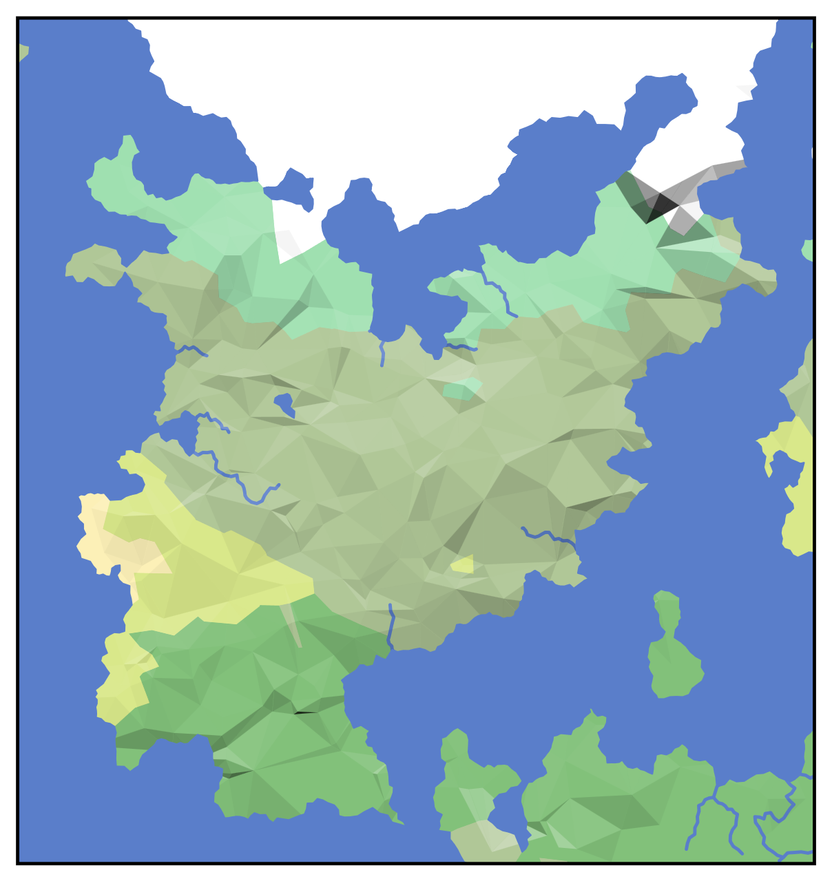
Once a surface is defined, we can start placing terrain on it. First, we partition it into tiles, each of which will have its own elevation, biome, and political status. On a planar map, it would be easy to make the tiles squares (like in Sid Meier’s Civilization IV) or hexagons (like in Sid Meier’s Civilization V). On an arbitrary curved surface, though, tessellation is more difficult. To ensure that the tiles are roughly uniform in size and that the grid is not biased in any particular direction, Dunier uses a random Voronoi graph – we randomly scatter thousands of points across the surface and calculate the Voronoi polygon surrounding each point. This is quite similar to the domain partition that Azgaar uses; the only difference is that they use Lloyd relaxation to make the tiles more regular. I prefer the unrelaxed graph, personally, as I like the variety of edge lengths that it gives you.
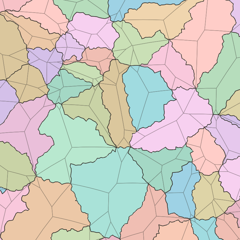
We aim for each tile to be around 30 000 km2 in area (the area of Lesotho, Hainan, or Lake Erie). That puts a lower limit on the scale of our map, as features cannot be smaller than a tile. To create the illusion of finer resolution, we add greebles to each polygon edge using the midpoint-displacement algorithm. To ensure that the greebled edges do not intersect with each other, the random displacement is limited such that no edges cross the tiles’ straight skeletons. The line segments in the tiles’ straight skeletons naturally form a convex polygon around each edge, ensuring that no matter how much any given edge meanders on account of its greebles, it will never venture into another edge’s space.
With the domain defined, we can begin generating terrain. First, the world is divided into n plates according to the following routine:
- The tiles are arranged into a random order.
- The first n tiles each instantiate a new plate.
- For each subsequent tile:
- The Voronoi diagram of it and all previous tiles is calculated.
- If the addition of this tile breaks a previously contiguous plate in two, then the tile is added to that plate such that it remains contiguous.
- Otherwise, the tile is added to the same plate as its nearest neighbor that comes before it in the order.
Generating elevation
Next, we define the elevation map. First, half of the plates are made ocean by setting their elevation to −4 km. The remaining half are made land by setting their elevation to 0 km. Next, pink noise is added to the elevation map. For this we use a simple midpoint-displacement algorithm similar to diamond–square noise (but with Voronoi polygons instead of diamonds and squares). It goes like this:
- The tiles are arranged into the same random order as above.
- For each tile, the Voronoi graph of it and all previous tiles is calculated.
- Its “parents” are defined as all previous tiles that border it in this intermediate Voronoi diagram and are on the same plate as it.
- If the tile has no valid parents, then its elevation is offset by a random number drawn from a normal distribution.
- Otherwise, its elevation is set to the average elevation of its parents (weighted by the inverse of the distance between it and each parent) plus a random number drawn from a normal distribution.
The key factor that makes this noise function pink is the fact that the deviation of the normal distribution used for each tile is proportional to the average distance between the tile and its parents. This means that as the algorithm proceeds, the intermediate Voronoi diagrams have more cells in them, the average parent–child distance goes down, and the magnitude of random variation goes down.
Now, plate tectonics are incorporated. First, each plate is assigned a random velocity. Then, at each boundary between two plates, the relative speed that they move toward or away from the boundary is calculated, and one of three things will happen.
If the relative speed is zero (that is, the plates are not moving, moving with the same velocity, or sliding parallel to the plate boundary) then nothing happens.
If they’re moving away from each other, then a young ocean is formed along the plate boundary. This basically means that if one or both of the plates were already ocean, then they’re unaffected, but if one or both of the plates were land, then its elevation is decreased by 4 km in the vicinity of the plate boundary. The ocean’s width is determined based on the relative speed of the plates, and is on the order of the typical plate size. A low thin ridge is also added along the boundary if the ocean is wide enough to accomodate it.
If they’re moving toward each other, then a mountain range is formed. If both plates are land, then a large symmetric mountain range is formed – the elevations of all tiles in the vicinity of the plate boundary are increased. The height and width of the mountain range depend on the relative speed, but the mountain range is generally smaller than the ocean formed by a divergent boundary. If at least one plate is ocean, though, then whichever plate has a higher elevation will be raised up and the other will be pushed down, forming both a mountain range and a deep sea trench. In this case, the height and width of the mountain range still depends on the relative speed, but is generally smaller than for the symmetric case.

Of course, while the largest mountain ranges in the world correspond to active fault lines, most mountain ranges are left over from previous fault lines where continents have since permanently fused together. To account for this in Dunier, the plate tectonics simulation is repeated with twice the number of plates. These “sub-plates” have lower velocities on average than the main plates, so the mountain ranges they form are smaller. The second round of plate tectonics also does not form young oceans; diverging subplates form rift valleys instead (a narrow region of decreased elevation surrounded by narrow bands of increased elevation).
Now, the ocean can be defined. The naive approach would be to set a sea level and make every tile below that level into ocean. This would create a large number of lakes near the coast, though, which is not realistic. In reality, sub-sea-level depressions near the coast often go unfilled, such as the Qattara Depression. So instead, we identify the largest contiguous region below sea level and flood-fill it, leaving any smaller depressions dry. This is still not quite right, since plenty of inland depressions both above and below sea level do fill with saltwater and are effectively seas in their own right, such as the Caspian Sea. What I really want is to do a hydrologic simulation over long timescales where basins fill, dry up, and drain into each other to determine the most realistic number and placement of saltwater basins. But that would be really hard, so instead I do the single-largest-contiguous-region thing.
Generating terrestrial ecoregions (biomes)
Next, the terrestrial ecoregions of the world are defined. The ecological character of a given tile depends on its average annual temperature and average annual rainfall.
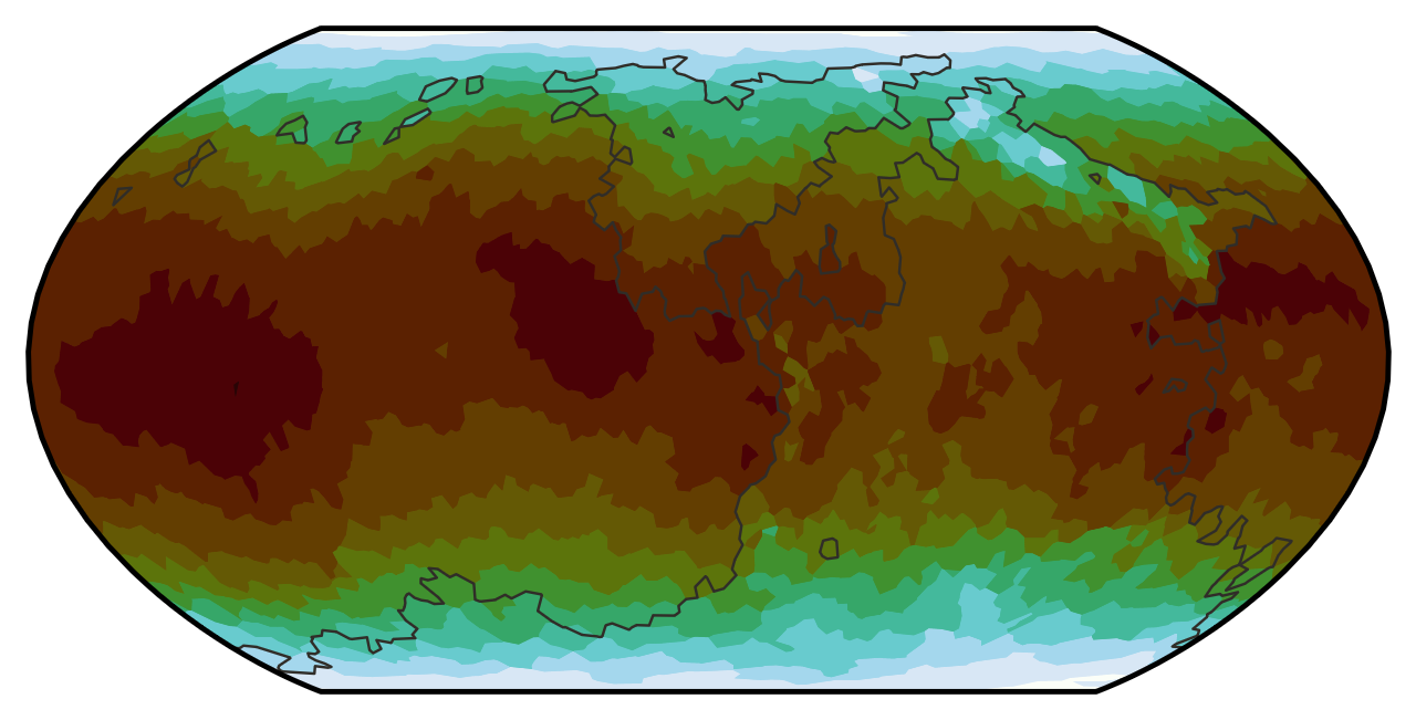
Temperature is pretty straightforward; it primarily depends on the insolation at the tile’s latitude s(φ) (raised to the ¼ power as per radiative thermal equilibrium) and the average global temperature Tavg (15 °C by default, but the user can turn it up or down). Temperature also decreases with altitude h. We also add in some random noise N to account for ocean currents and wind patterns and everything else I don’t feel like simulating. The noise is generated using the same diamond–square-like algorithm used for elevation. The only difference is that the randomness at each point is proportional to the mean parent–child distance squared, so the noise is red instead of pink. All together, that results in the following formula for temperature:
T(φ, h) = Tavg [s(φ) exp(−0.04 km−1⋅h)]¼ + N
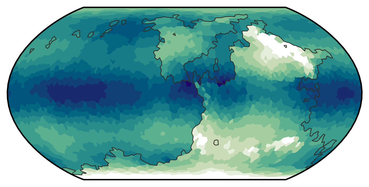
Rainfall is slightly more complicated. Base rainfall levels are derived from the rainfall distributions r(φ) I described in the previous section, and like temperature, it is lower for higher elevations and has a red noise component.
However, prevailing winds are accounted for to some degree because I want to produce rain shadows – sharp gradients in vegetation density across north–south mountain ranges due to moist winds from the ocean being blocked. First, a wind velocity field is defined. Rather than a realistic velocity field with multiple opposing cells, I simplified it such that prevailing winds always blow from the east (except on tidally locked planets where it blows from the dark side). Each ocean tile is assigned a certain amount of “moisture”. That moisture then propagates downwind. When moisture passes over land, it increases the rainfall there by a little bit, and the amount of moisture passed on to the next tile is decreased a little bit. Moisture is blocked by tiles over a certain elevation. This has the result that land directly west of an ocean will get a boost to its rainfall, unless it’s separated from that ocean by a mountain range.
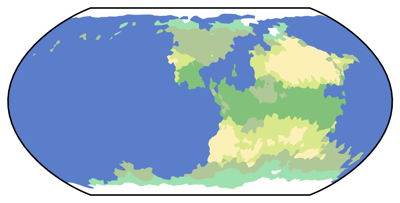
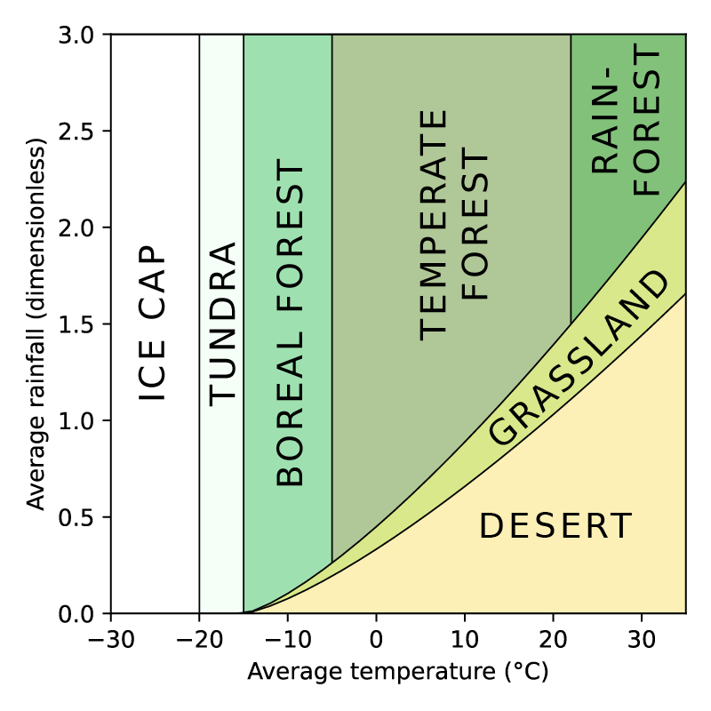
Now we can assign ecoregions using a simple two-dimensional classification system. In Dunier, there are seven basic types of biome, and tile is assigned one based on its temperature and rainfall:
- Permanent ice cap (extremely cold)
- Tundra (moderately cold)
- Desert (hot and extremely dry)
- Grassland/shrubland (hot and moderately dry)
- Boreal forest (wet and slightly cold)
- Temperate forest (wet and slightly hot)
- Rainforest (wet and moderately hot)
Generating lakes and rivers
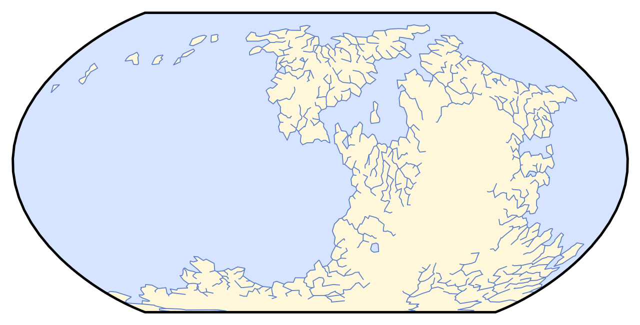
The final aspect of the physical geography that must be generated is hydrology – lakes and rivers. Any given edge between two tiles can be a river; if it is, it will have a flow direction and a discharge rate. Two edges may flow into the same vertex, but each vertex can only have one edge flowing away from it. Rivers are built bottom-up, spawning at the coast and growing uphill, branching as necessary. They will follow the steepest route to connect as many vertices to the ocean as possible. This is, obviously, the opposite of how rivers propagate in real life. But going in this direction increases the average length of rivers, which I think makes the maps look more interesting.
If rivers are only allowed to propagate uphill, then most of the map will still form inaccessible endorheic basins. Thus, to improve coverage, they are allowed to propagate up to 200 m downhill. This allows them to clear small bumps and reach much farther into continental interiors, though they still won’t reach all of it. Once the rivers can propagate no farther, the discharge of each river segment is calculated by summing the rainfall of every tile that touches its watershed.
Lakes are then placed along river segments that flow at least 150 m uphill. For a tile to become a lake, it must not be adjacent to the ocean and have exactly one river flowing away from it.
History simulation
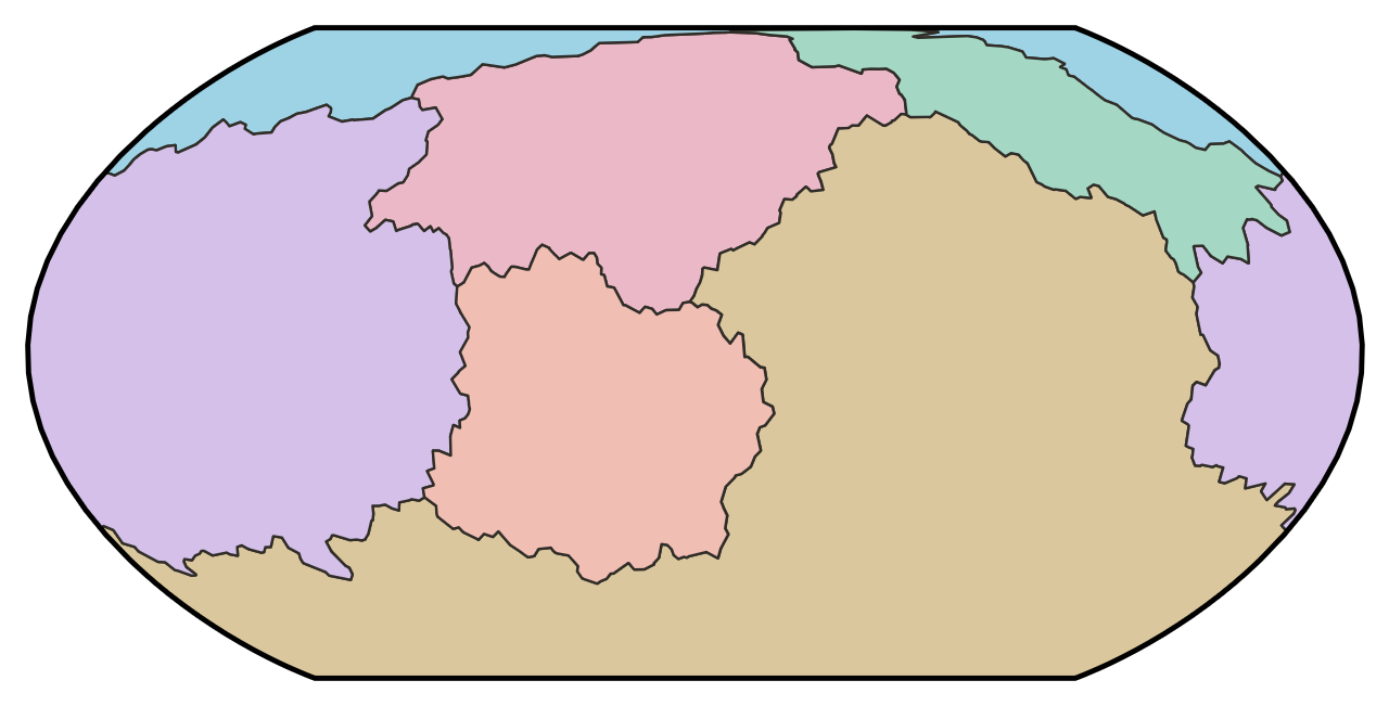
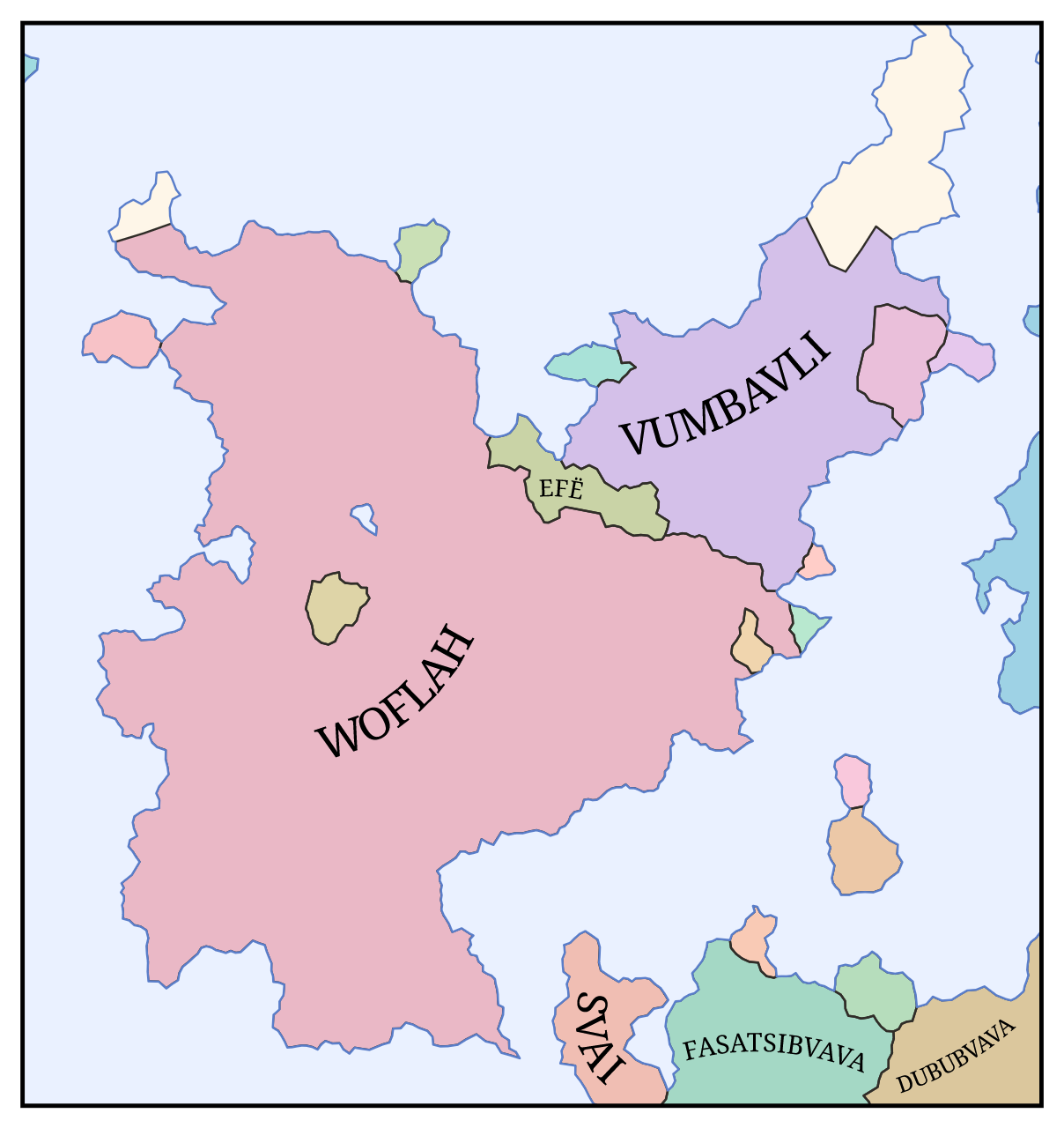
Now that the world’s physical geography is established, we must simulate the history of human civilization. Most fantasy map generators simply seed some countries, assign them growth rates, and let them expand until they’ve filled the map. In order to create plausible distributions of languages and national histories, though, Dunier must model it in more detail than that. Dunier models history using two main units, states and cultures, which spawn, grow, and fall over the course of around 4000 years. The resulting map represents a snapshot of the world right at the end of that simulation, and the factbook lists important events that transpired up to that point.
Have I modeled it in too much detail? Probably. But the work is already done so stop complaining and look at this cool simulation I made.
Simulating the growth of states
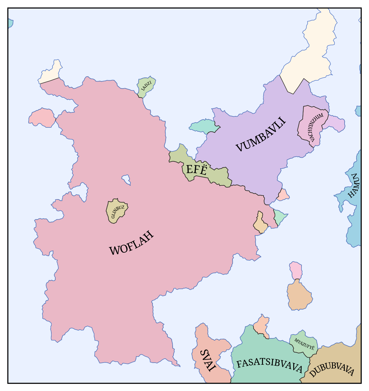
States are the political units that are actually colored on the map. A state may be a kingdom with a centralized government, a collection of nomadic tribes united only by cultural identity, or anything in between. Each state has a territory composed of some number of tiles, and two states’ territories may not both contain the same tile.
States spawn in one of two ways. The first is through spontaneous civilization – a tile that was blank but ostensibly inhabited by uncivilized hunter–gatherers spontaneously forms a new state with a corresponding new culture. The twoth is through rebellion – a tile that is part of an existing state’s territory forms a new state with a copy of whatever culture it had before. Both of these happen at a rate proportional to the tile’s population. Either way, the state starts with a territory of just one tile, but can gain more through conquest.
The population of a tile is the product of its area, its terrain modifier, and the technology multiplier of the state that occupies it. The terrain modifier is based on the biome (temperate forests have the highest population densities, followed by rainforests, grassland, boreal forests, tundra, deserts, and ice) and is higher for tiles adjacent to oceans, lakes, and rivers. The technology multiplier is a property of the occupying state and increases over time. For tiles not claimed by any state, the technology multiplier is set to the minimum value of 1. In addition to setting the rate of rebellions and technological advancement (which we’ll discuss shortly), population also determines the shape of a state’s borders. If a border is between two tiles with average population densities of at least 0.3 km−2, it is rendered at high resolution on the map; otherwise, it’s simplified to straight lines.
The rate at which a state conquers its neighboring tiles is determined by its invasion speed, which is the product of each tile’s terrain modifier and the state’s military strength. The terrain modifier for invasion speed is different than for population density (grasslands are the fastest to traverse, followed by forests, deserts, tundra, and ice) and is lower when the tiles being traversed have large differences in elevation. The state’s military strength is the product of its innate militarism, which is chosen at random when it spawns, and its technology multiplier. If the tile being conquered is already part of another state’s territory, then that state’s military strength is subtracted out (meaning that a state cannot conquer territory from a stronger state). The time required to conquer any given tile is drawn from an exponential distribution whose mean is equal to the tile’s area divided by the length of the edge connecting it to the invading state, times the invasion speed.
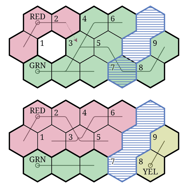
As a state expands, the path it takes is encoded in a tree structure. Each tile is subordinate to the tile from which it was conquered, and when a tile is taken from one state by another (including when it’s taken by a rebellion), all of the tiles subordinate to it are taken as well. This ensures that states are always contiguous, and makes it possible for borders to change very quickly.
The exception to this rule is uninhabited tiles, which include oceans, lakes, ice sheets, and landlocked deserts. When an uninhabited tile is subordinate to a tile that is conquered, it reverts to being unclaimed rather than joining its parent in the conquering state. This is important because otherwise states adjacent to uninhabited regions become too large, as there are no rebellions to break them up there. If an inhabited tile is subordinate to an uninhabited tile that is released this way, then it spawns a new state.
Whenever a state’s border changes, it is checked for holes. If a state occupies more than half of a tile’s neighbors and has the military strength to conquer the tile but does not yet occupy that tile, then it conquers it immediately. This prevents borders from becoming too jagged and discourages small holes from appearing in a state’s territory.
States’ sizes are usually moderated by rebellions, as the larger one is, the more frequent its rebellions will be. As an added limit on states’ sizes, every state’s military strength also constantly decreases over time. Exactly 2000 years after a state is born, its military strength will hit zero, meaning that it can no longer conquer new tiles or resist being conquered by other states.
A key factor determining the sizes of states and the rate that borders change is technology. Each state has a technology multiplier which affects three things: military strength, population, and the rate at which the technology multiplier increases. This means that technology increases exponentially. To be precise, the rate that it increases is proportional to the population of its most populous tile. This means that states in population-dense forests have higher technological growth rates than states in sparsely populated tundra. One unintended consequence of this approach is that small isolated islands are often the most technologically advanced societies in the world. This is not very realistic, but it’s a cool enough storytelling idea that I don’t mind it.
Of course, in reality, political borders don’t stop the spread of technology. Thus, Dunier allows technology to diffuse across borders. When a state borders another with a higher level of technology, it gets a boost to its technological advancement rate that’s proportional to the technological gap between them. This spreads technology out such that adjacent states usually have similar technology multipliers as each other, but isolated states may lag behind or outpace their peers.
It’s worth noting that none of these mechanics allow a claimed populated tile to become unclaimed – once a tile has been conquered, the only way it can leave its state is by being conquered by a different state. There is one exception to this rule, which is cataclysms. Cataclysms can be set to occur periodically, and whenever one hits, half of the tiles in the game will revert to being unclaimed. Any subordinate tiles will immediately spawn new states, assuming they aren’t wiped by the cataclysm as well.
Simulating the spread of cultures
Underlying the states are cultures, which are smaller units that don’t appear on the map, but that affect the generation of names and are described in the factbook. Each culture has a homeland, a language, and a variety of cultural features. These features may include things like social structure (sedentary or nomadic pastoralist), annual celebrations, traditional garb, architectural style, or a national sport. These features are basically generated via Mad Libs. For example, if a culture has a national sport, that sport will have a basic action (pushing, throwing, carrying, …), an object (balls, discs, each other, …), a goal (into a net, at a target, over a line, …), and a requisite condition (in a certain amount of time, while riding a horse, without using their hands, …). This may produce a sentence in the factbook along the lines of:
The national sport is Azoa, in which players attempt to throw other players into a net while riding a horse.
There are some constraints to prevent implausible cultures. For example, it’s not possible to carry a ball without using one’s hands. Even with these constraints, though, this system allows for countless unique cultures to be created, and makes it easy for them to change over time (by substituting one word at a time).
Every state is assigned a dominant culture when it spawns. If the state appeared on an unclaimed tile, then its dominant culture is randomly generated; if it spawned on a tile that was part of another state, then its dominant culture is a clone of whatever culture was already in that tile. In both cases, the new culture’s homeland is defined as the tile where the new state was spawned.
When a state conquers an unclaimed tile, its dominant culture spreads to that tile. But when a state conquers a tile from another state, the tile keeps the culture it already had. In this way, cultures keep a record of what states occupied each tile in the past. That record doesn’t last forever, though, as the new state’s dominant culture will supplant the indigenous culture in each tile that it occupies after some random amount of time (160 years on average).
Simulating the evolution of languages
Perhaps more important than the culture itself is its language. While Dunier doesn’t construct grammars or full lexicons for its languages, it does construct a phonology for each one, and uses that phonology to generate names for the associated cultures and states. Like cultures, languages change over time. However, two related languages don’t count as distinct unless they’ve evolved independently for at least 500 years. So if a state splits in two, the two successor states’ cultures will be said to speak the “same language” for 500 years, after which their dialects will have diverged enough to say that they speak two different languages.
Each language starts out as a collection of letters, a syllable structure, and a collection of common affixes. The letters are chosen from a list of common sounds. A language may have a small phonology (for example: three vowels, a couple nasals, some plosives, maybe a semivowel or two), a large phonology (including rarer vowels like /ø/ and rarer consonants like /θ/), or something in between. Similarly, it may have a strict syllable structure (only CV syllables like /me/), a permissive syllable structure (allowing CLVC syllables like /mlem/), or something in between. Words are constructed by generating random syllables and sticking them together.
Many languages also have affixes that are attached to the starts or ends of words. These are generated in the same way as roots, and may include gender affixes like “-um” and “-a” or semantic affixes like “-land” and “-ese”. For a single name in isolation, this doesn’t do much since two gibberish words concatenated together is still gibberish. But when there are multiple words from the same language family, it makes relationships between them apparent. For example, the state Vumbavli may be inhabited by the Vumbivaz culture (“-avli” and “-ivaz” meaning “-land” and “-ish”). Or two adjacent countries may be called Fasatsibvava and Dububvava (“-bvava” being similar to the real-world suffix “-istan”).
As time passes, languages are changed via phonological processes. There’s a long list of possible processes that languages randomly choose from. They include simple sound changes (like “/s/ becomes /h/” or “/tja/ becomes /t͡ʃa/”) as well as more complicated things like vowel harmony (when all of the vowels in a word are forced to have the same height or frontness), stress placement (put primary stress on the first syllable and secondary stress on every-other syllable after that, or something), and syllabification.
This theoretically produces more realistic languages than you get from just sticking random letters together, since after some amount of time each language will bear the scars, so to speak, of its past changes (much like how the absence of the clusters /rj/ and /ʃj/ in English, despite the presence of /mj/ and /kj/, hints at the historical process of yod-dropping). It is, however, also extremely difficult to tune. The frequency of a letter depends on the probabilities of all the processes that interact with it and is difficult to estimate through anything other than trial and error. I tried to set the process probabilities to produce somewhat realistic phonologies, but I’m not sure I succeeded. For instance, I think my languages have too much /f/ (probably because /p/, /v/, and /θ/ tend to become /f/, but /f/ rarely becomes anything else)
Anyway, when generating a state name, all you need to do is find the relevant language’s original ancestor, combine random letters from its phonology, stick on any relevant affixes, and then apply all of the subsequent languages’ phonological processes. When generating the name of a person, there is one more layer of complexity in that personal names have different structures in different languages. In Dunier, each language has its own name structure which takes the following form:
- One or two given names
- Optionally, one patronym
- Optionally, one or two family names
- Optionally, “from” plus the name of a city
This represents the default name order; in one third of languages the components are reversed.
Of course, whether a name is given or patronymic or whatever isn’t immediately apparent to the user – they’re all just gibberish. But it matters when you look at many names from the same language. Patronyms all have the same affix (think of “-son” in Scandinavian names), family names have one of three affixes (think of “-er”, “-mann”, and “-rich” in German names), and city names have the same clitic (think of “Di” in Italian names) plus one of three affixes (think of “-ton”, “-ham”, and “-burg” in Anglic city names).
So a generated name might look something like:
Mea Jatifima Iʻama Ī-Janami
where “Mea” is a given name, “Jatifima” and “Iʻama” are family names (“-ma” being a family name suffix), and “Ī-Janami” means “from Janami” (“-mi” being a city name suffix).
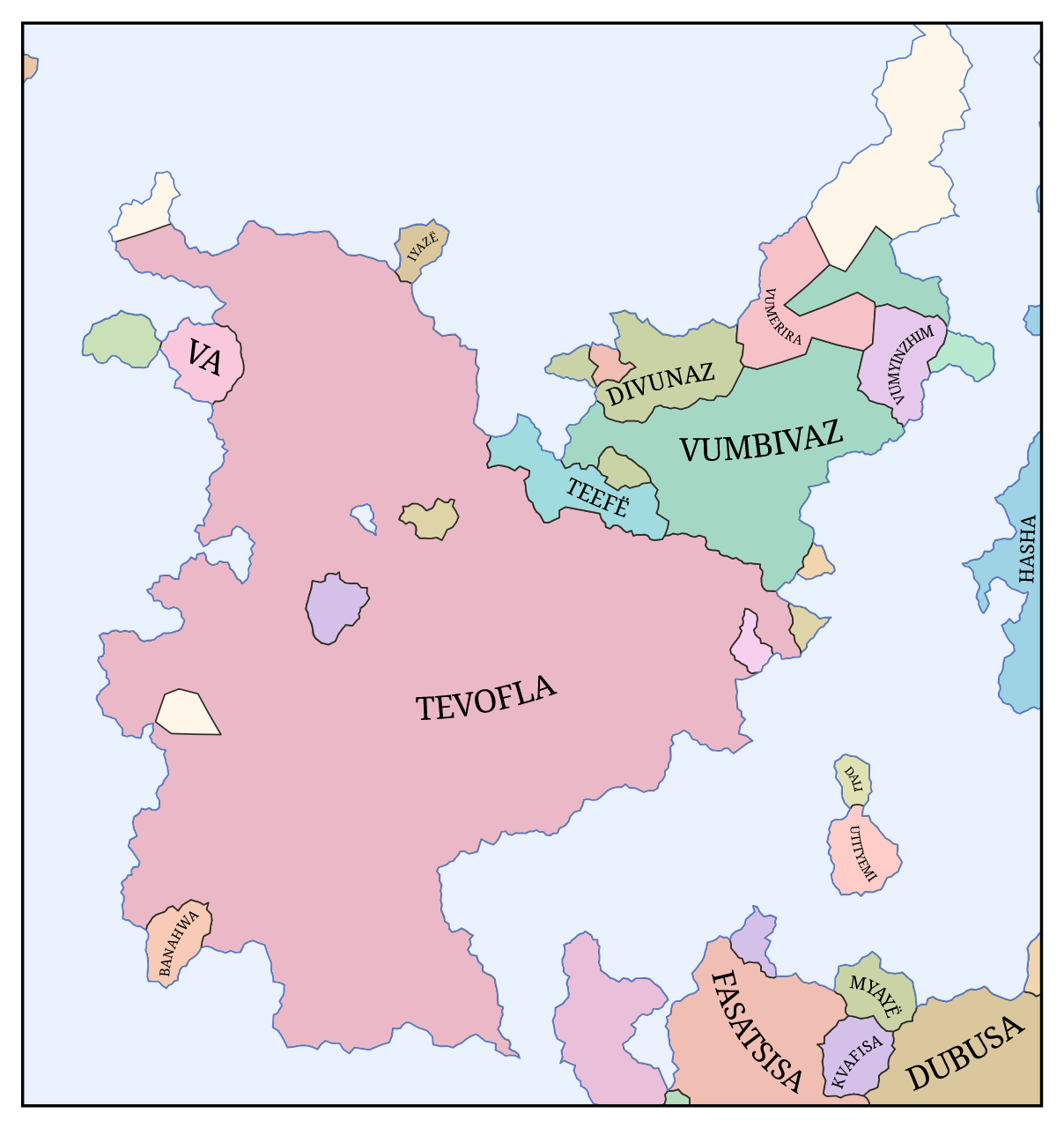
Map composition
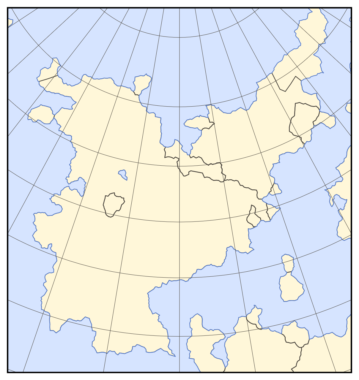
Now that the world is fully simulated, the final step is to map it. The first step is to define the mapping from the planet’s surface to the map plane. For a planar planet, this transformation is trivial. Spheroidal and toroidal planets, though, require a map projection.
Map projections
Dunier supports four types of map projection: Bonne, Lambert conformal conic, Mercator, and Equal Earth. I chose these because they are relatively common and all have different qualities that make them good for fantasy maps. The Bonne projection was popular in the sixteenth century and is similar to Ptolemy’s second projection as used in Nicolaus Germanus’s and Johannes Schnitzer’s 1482 world map (which I consider the archetypical medieval map). Lambert’s conformal conic projection has very little distortion when applied to small regions and is a common choice among professional cartographers today. The Mercator projection has been common in European maritime maps since the thirteenth century and was almost ubiquitous for world maps during the Age of Exploration. And the Equal Earth projection is a good general-purpose equal-area projection that has seen much popularity in recent years (the African Union essentially endorsed it in August).
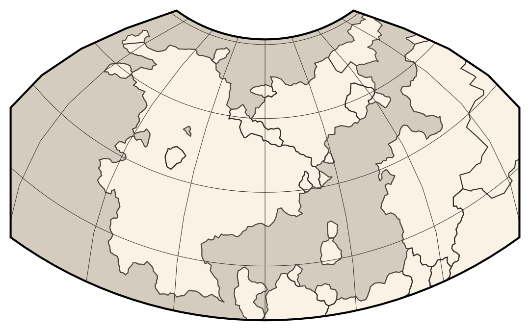
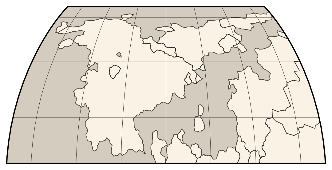
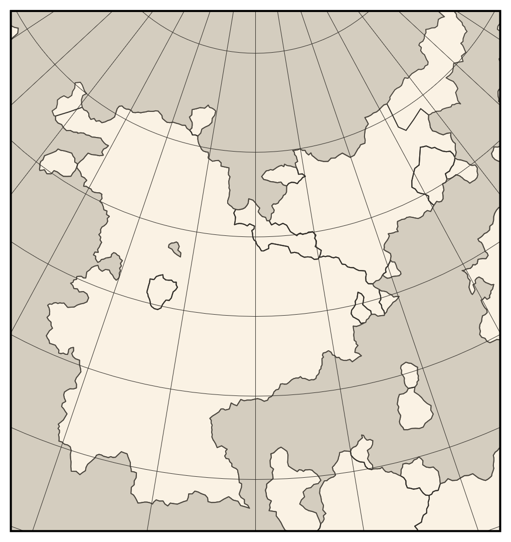
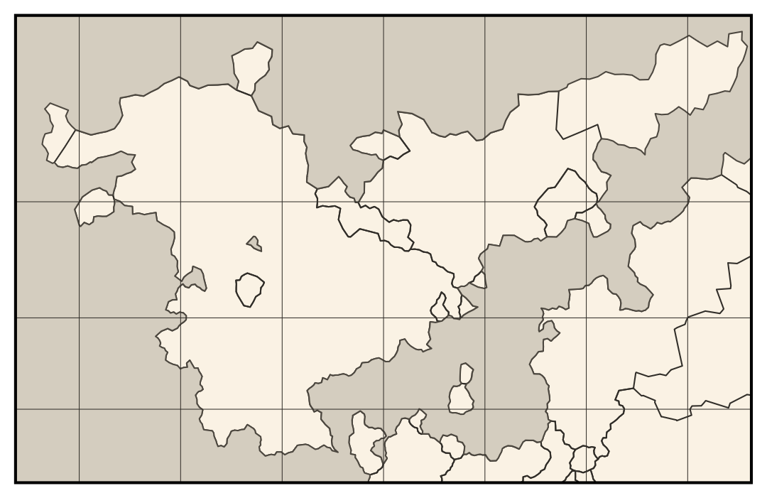
Using them in Dunier, however, not quite as simple as lifting their equations out of Flattening the Earth. That’s because the first three are only defined for spheroids, and Equal Earth is only defined for spheres. None of them will work in their canonical forms for toroids. Luckily, the first three are all based on simple mathematical principles and can thus be generalized easily. The Bonne projection has concentric parallels and is equidistant along parallels and the central meridian. For any given surface, there is only one map projection that satisfies those three criteria. Similarly, Lambert’s conformal conic projection is conformal and conic, and the Mercator projection is simply the limiting case of Lambert conformal conic where the meridians are parallel. Analytically solving for these projections on a toroid would be challenging (it took almost a hundred years to analytically solve for the Mercator projection on a sphere), but it’s simple to solve for them numerically.
The Equal Earth projection is more complicated, though, as it was designed by a human rather than based on mathematical principles. There’s no telling what coefficients Bojan Šavrič and crew would have chosen if they lived on a highly oblate world, or on a toroid. However, there is a way to define a equal-area pseudocylindrical map projection that generalizes to any rotationally symmetric surface: define a horizontal scale function w(r) that takes as input the true length of a parallel divided by the average true parallel length and outputs the length of the parallel on the map, then adjust the spacing of the parallels to achieve area equality. Put mathematically, given the spacing between parallels ds∕dφ and the radius of a parallel R, the projection is:
x = λ ⟨R⟩ w(r(φ))
y = f(φ)
f′(φ)⋅w(r(φ)) = ds∕dφ⋅r(φ)
r(φ) = R/⟨R⟩
The third equation can be solved numerically to obtain f(φ). Your choice of horizontal scale function w(r) determines what projection you get. And since these equations only deal with the properties of individual parallels, a given horizontal scale function can be applied to an oblate spheroid or a toroid just as well as to a sphere. For the Equal Earth projection, I fit the following horizontal scale function:
w(r) = 1 − 0.29½ + (0.04 + 0.25 r2)½
When applied to a sphere, this produces a projection indistinguishable from the Equal Earth projection. So while it’s technically different from the Equal Earth projection, it’s close enough that I’m comfortable calling it “Equal Earth”.
Layers
Once that’s done, we can start drawing map data. Data is arranged into several layers, which the user can turn on and off:
- Terrain texture – little pictures of trees and mountains characterizing the biome at each location
- Coast texture – horizontal hatching around the coast to highlight the landmasses
- Shaded relief – shadows and highlights showing the topography of the land
- Rivers – blue lines showing where rivers are
- Borders – black lines showing the outlines of states’ territories
- Graticule – lines of latitude and longitude
- Windrose – a decorative compass rose in the corner
- Political labels – text giving the name of each state
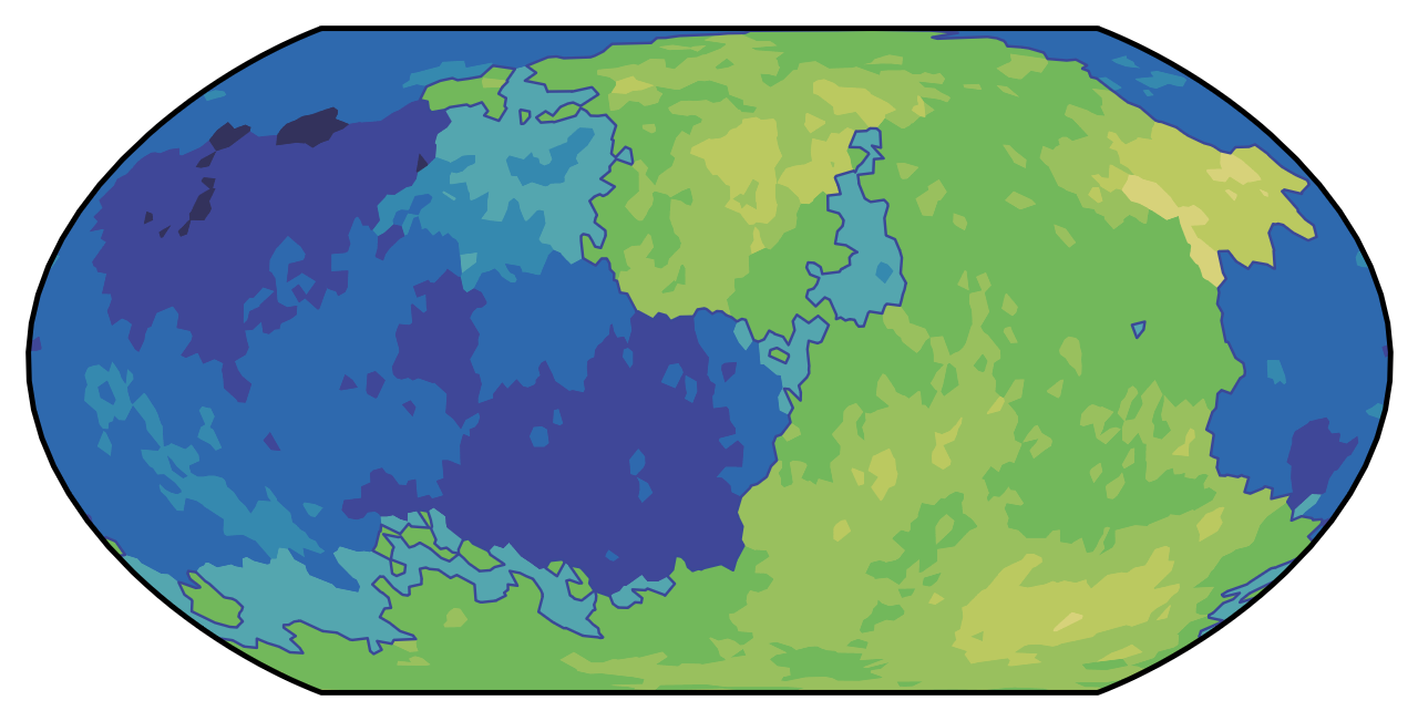
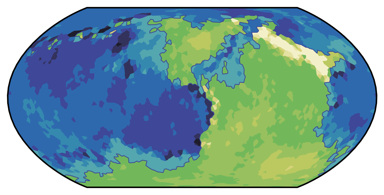
In addition, there are color schemes that can be used to show different types of geographic data:
- Physical – shade in each ecoregion according to how it would look from space
- Political – shade in the states with different colors
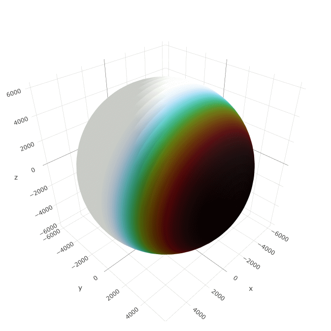
- Heightmap – color-code tiles according to their elevation
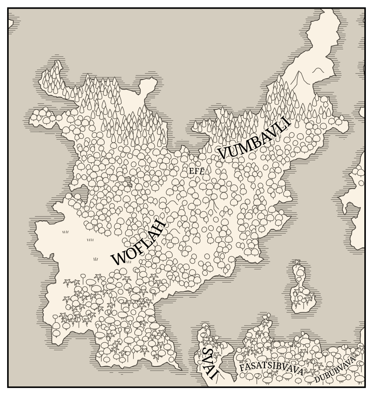
I think all of these are fairly self-explanatory, but I will say a bit about the terrain texture, since it was not trivial to implement. I drew pictures of the kinds of plant-life that might appear in each type of biome – grass for tundra and grassland, broad-leafed trees for temperate forest, coniferous trees for boreal forest, a variety of trees including palms for rainforest, and dead shrubs for desert. For each map, we randomly sprinkle those pictures around each ecoregion. To obtain a somewhat uniform but random-looking distribution, I used Poisson disc sampling, for which I did not use Bridson’s algorithm (I used a grid-based dart-throwing algorithm with modifications to account for multiple disc radii and arbitrary domain shapes). I also drew pictures of mountains that get sprinkled on any land above a certain elevation.
Labels
One thing that mandates a pretty long aside is the labels. It turns out that, given a word and a region of arbitrary size and shape, it’s not easy to find the optimal location, orientation, and font size for the label. I ended up implementing an algorithm published by Filip Krumpe and Thomas Mendel (arXiv, 2020). It estimates the medial axis of each shape, fits an arc to part of it, and then finds the largest label that can be placed along that arc. The one modification I made is to put an upper limit on the font size. I’m a fan of arc-shaped labels because they look much more organic than straight labels. However, my implementation of this algorithm does give wacky results sometimes, so this is an area that I think could use more work.
Of course, to label a place you need to know how its name is spelled. But the language construction work we did in the last section only determined how words are pronunced. In-universe, some of the languages ostensibly have their own fictional writing systems, while others have never been written down in the history of their fictional world. But that’s not useful for labelling a map – even if I wanted to simulate the invention of writing, the labels should be in a form that the readers can parse. Thus, the fantasy names must be transliterated to real-world writing systems.
For this, Dunier offers seven options. The default option maps every possible phoneme to its most typical counterpart in the basic Latin alphabet. This results in simple-looking names that are relatively easy to pronounce, but that may not have enough information to pronounce “correctly”. There’s also the “native” option, which assigns each language one of four Romanizations that are designed to resemble real languages that use the Latin alphabet. This results in names with a lot more diacritics that look more realistic but may be more intimidating to readers. The remaining five options attempt to mimic the spelling style of a particular language – Latin, Spanish, English, Russian, or Japanese. These are pretty complicated, as each of these languages has its own special spelling rules and phonotactic constraints that are hard to automatically apply to fictional words. But overall, I’m quite proud of the result. For example, consider these six possible transliterations of a name that’s pronounced /wiki/:
| Style | Transliteration |
|---|---|
| Default or native | Wiki |
| Latin | Vici |
| Spanish | Huiqui |
| English | Weeky |
| Russian | Вики |
| Japanese | ウィキ |
Future work
While I’m quite proud of what I’ve achieved with Dunier, I think it still has a lot of room for improvement before it can really rival Azgaar’s fantasy map generator. My top priorities are cities, small islands, and a wider variety of types of civilization.
First of all, a fantasy world is not complete without cities, in my opinion. Generating them shouldn’t be too hard, but I want to take time to make sure they get mentioned in the factbook with realistic population estimates, and that I have a robust system to label point features.
Small islands will address the main limitation of the terrain generation: while greebles on the coastlines create the illusion of arbitrarily fine scale, it is currently impossible to make islands smaller than the size of a tile (the size of Hainan, or maybe Sicily if you’re lucky). Some of my favorite real-world places are islands much smaller than that. Thus, I’d like to implement a system that allows ocean tiles to have small islands inside them.
Third, I want to address the fact that, by default, every country is essentially a nation–state, which is completely unrealistic. In reality, states are a somewhat recent phenomenon, and nation–states are even newer. Most of human history has been dominated by small hunter–gatherer societies, and even when states began to emerge most of them were very small – individual tribes and cities. This aspect of Dunier is a major oversimplification, and a missed opportunity to push for the representation of a wider variety of societies in fiction. I haven’t decided exactly how that should work yet, but it’s something I’m thinking about.
Beyond that, there are a variety of things I’m considering adding, but I don’t know if I’ll get to all of them.
- In addition to the three currently supported planet shapes (spheroid, toroid, and plane), I’m considering adding cylinders (like Halo or Ringworld) and contact binary planets (like Rocheworld).
- I’d like to simulate the effect of key resources having limited distributions. One of the most dramatic plot points of real world history was the extinction of horses in the Americas, which limited native Americans’ rate of technological advancement and contributed to the dramatic technological divide between them and Europeans in the Age of Exploration. I’d love to include that in fantasy worlds, and possibly even expand it (what if one habitable continent doesn’t even have humans, for instance?).
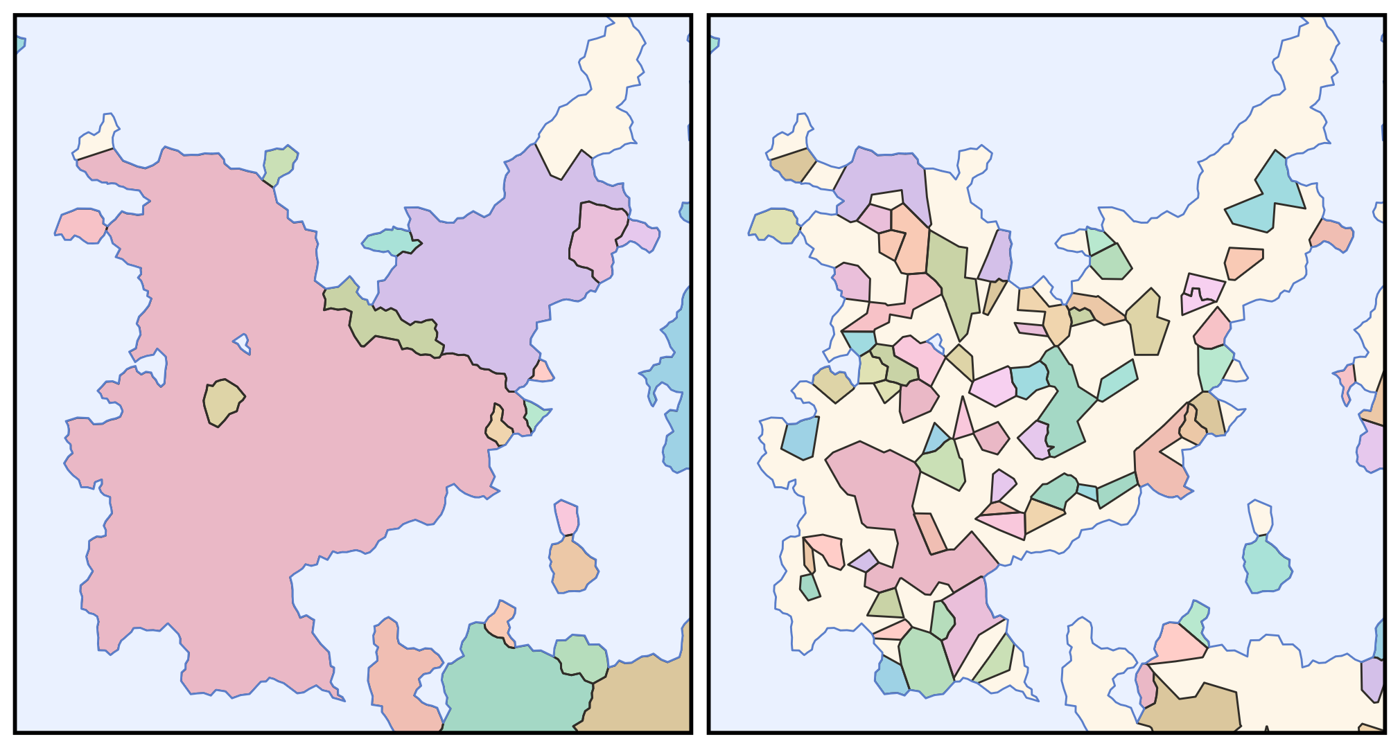
- I need a better algorithm for coloring states in the political map. Right now I have 23 colors that are assigned to the 23 largest states; anything smaller than that is left white. It shouldn’t be too hard to write an algorithm that reuses colors while taking care to avoid coloring adjacent states the same.
- I don’t like the way rivers look right now, and think it shouldn’t be too hard to smooth them out with Bezier curves so that they look better. Part of that is also choosing which rivers get shown – showing the longest rivers would probably look better than showing the river segments with the highest discharge rates.
- I’d like to revise the way sentences are arranged in the factbook so that they’re more natural sounding and less redundant.
- I’d like to improve the positioning and styling of the windrose, since right now it’s janky as heck.
- I’d like to add the option for a rhumbline network layer, which is basically like a graticule but cooler.
- I’d like to smooth out the shaded relief system, as it currently tends to have really sharp shadows that are hard to parse, and doesn’t work well with certain map projections.
- The label placement system needs work, and in particular I’d like to add an option to only use straight horizontal labels, as this is more common than curved labels in real maps.
Conclusion
Dunier is a new tool for procedurally generating realistic fantasy worlds. It starts by generating terrain onto a spheroidal, toroidal, or planar surface, accounting for plate tectonics and rain shadows. It then simulates human history on that terrain, including the spread of cultures and states, as well as the evolution of languages. It outputs two artifacts. One is a map of part of the world including state borders, a graticule, little pictures of trees and mountains, and state names transliterated as labels. The other is a factbook that details the demographics, culture, and history of each country in words.
Dunier is inspired by other fantasy map generators like Azgaar’s, but is novel in several ways. These include the use of map projections to render terrain from a curved surface, the use of phonological processes to simulate the evolution of languages over time, and the realistic terrain generation. But Dunier’s most significant contribution is the factbook, through which it goes beyond the functionality of a simple fantasy map generator and becomes a fantasy world generator.
While there are still a lot of changes I want to make to Dunier, such as the addition of cities and small islands and the incorporation of a wider variety of types of civilization, I believe that its current form marks a significant contribution to the state of the art of procedural world-building. It is my hope that the ideas outlined here inspire future procedural generation tools and simulations, and that Dunier itself proves helpful to world-builders, authors, and game-masters. I’m also looking forward to continuing to develop it, but I need to take a break for now. I have a long backlog of Wikipedia maps I need to get through.

Wow. I am in awe. This is a tour de force or a world-building Gesamtkunstwerk. Thank you for sharing. I haven’t explored every aspect of it yet, but I felt compelled to comment.I’m particularly impressed with:- Your inclusion of toroidal and flat worlds;- Your generalisation of the Equal Earth Projection;- The extremely pretty vector output maps: coast texture, tree icons blocking each other, curved labelsI enjoyed learning about:- Why I should use TypeScript;- Greebles;- Mad Libs.Is the pink noise distribution observed on Earth’s topography and the other planets we know about? In the long term, have you thought about making the procedure modular? You could have hydrology modules, weather modules, tectonics modules, even solar-system-formation modules — just as long as the input/output format matched the previous and next step in each case — and it would allow certain components (that you don’t feel like simulating) to be crafted by a different enthusiast.
Sorry, it removed my formatting
Haha, I was wondering what all the hyphens were for. Thank you for the kind words! To your question about the pink noise, I’m not sure. I’ve heard that coastlines are self-similar fractals, and pink noise is also called “fractal noise”, so there might be a relationship there. But I just picked it because I thought it looked right.
The modularity idea is a good one. I’ll have to think about that. It shouldn’t be too hard to drop in alternative functions with how I’ve written the code. There could even be options in the web interface so that the user can choose between fancy hydrology simulation and quick-and-dirty river generation.