Uncertainty quantification is an important part of scientific analysis, and one that’s become more widespread and complex with the rise in popularity of Bayesian analysis techniques. And what would uncertainty quantification be without uncertainty visualization – error bars or histograms for zero-dimensional data, and simultaneous or pointwise credibility bands for one-dimensional data.
Unfortunately, there has been very little discourse about uncertainty visualization for two-dimensional data, like images. I have yet to find anyone on the Internet mentioning it, and in the academic literature the only examples I’ve found where two-dimensional uncertainty is even quantified are this 2015 article in Inverse Problems in Science and Engineering by Michael Fowler and company, and this 2024 article in Review of Scientific Instruments by myself and others.
The purpose of this blog post is to assert that this uncertainty can and should be visualized, and put out one way this can be done. Specifically, by drawing credibility bands for contours.
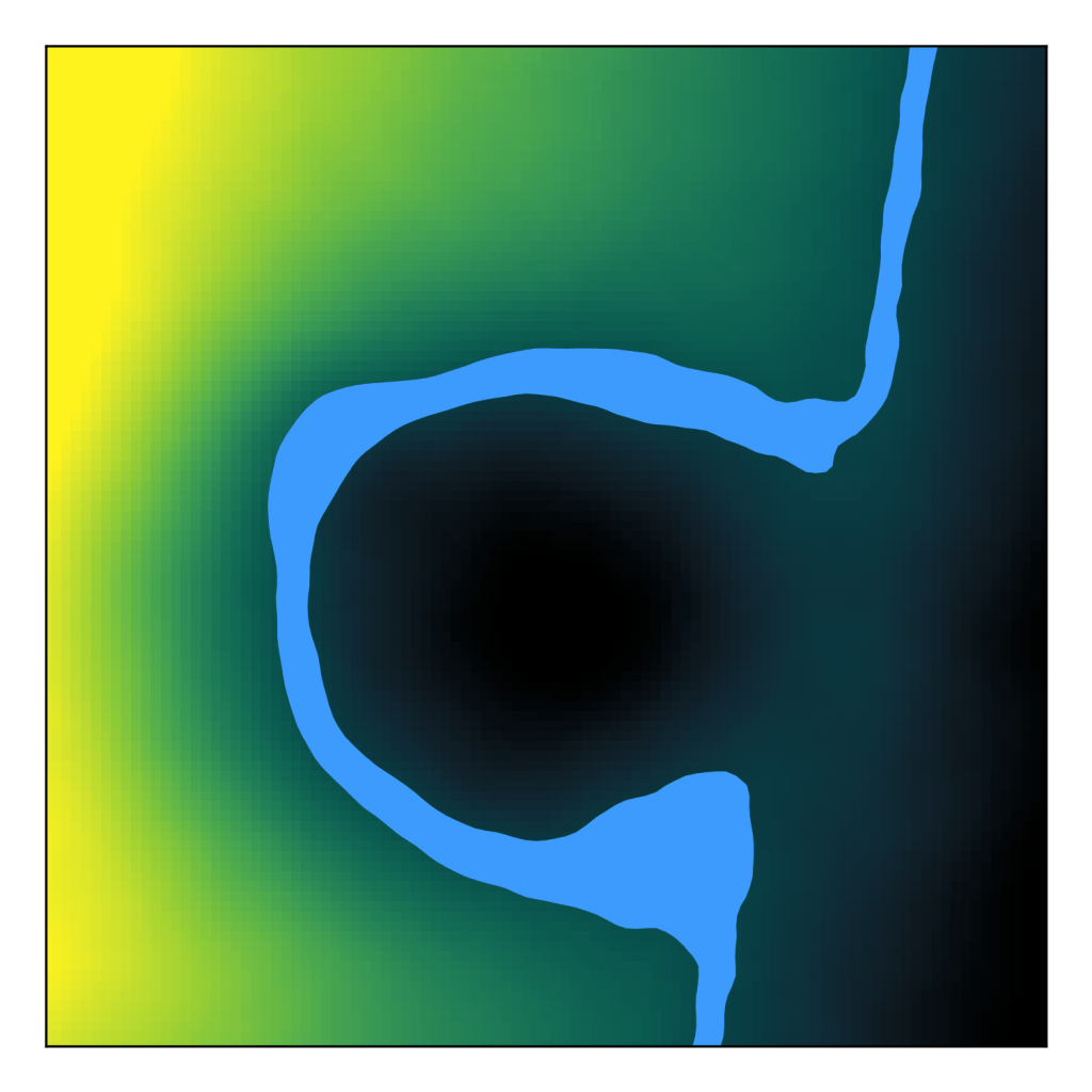
First, let’s assume that we’re trying to infer some quantity in two-dimensions, like altitude in physical space, pixel brightness in a radiograph, or a cost function of two parameters. Suppose we infer a posterior probability distribution for that data using something like Markov chain Monte Carlo or variational inference. A few samples from that distribution might look like this:
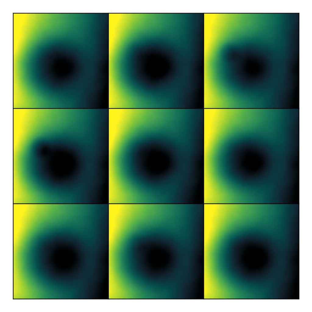
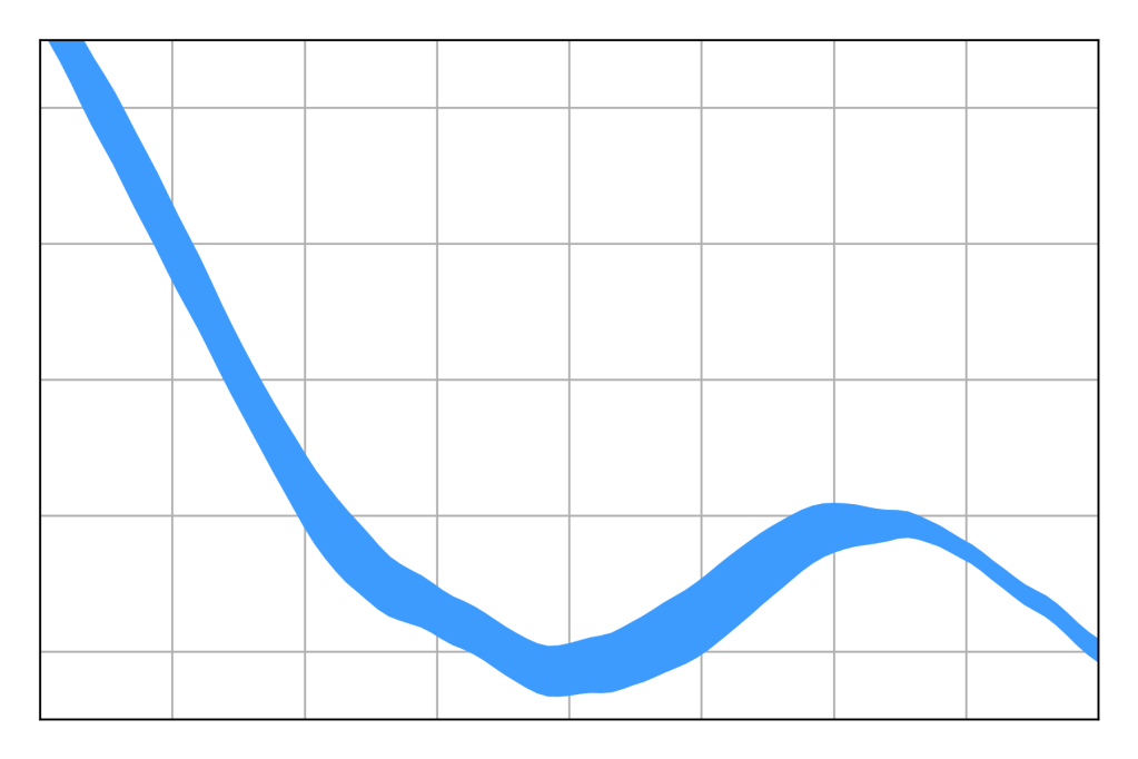
Looking at random samples like this is a good start, as the amount of variation between samples is suggestive of the amount of uncertainty in our inference. However, it would be preferable to have them all together on one plot. We can do this easily for one-dimensional data. Consider the horizontal lineout through the center of the image.
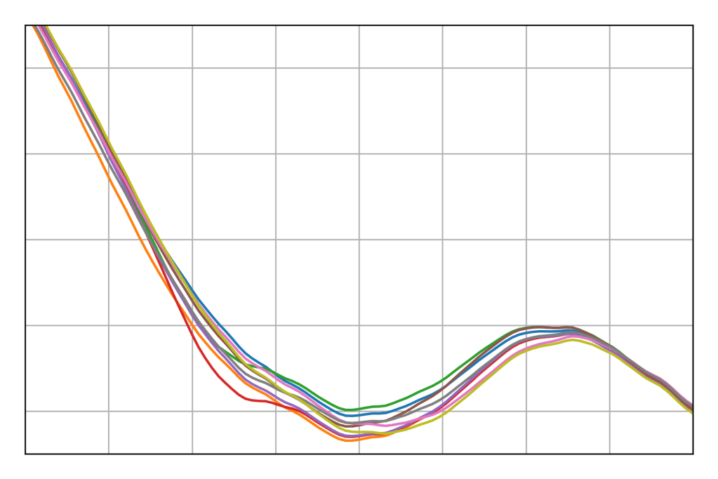
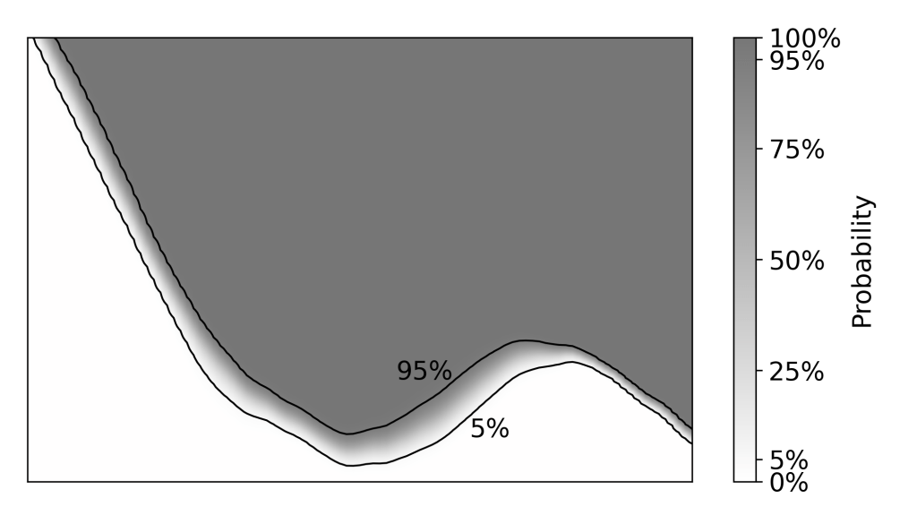
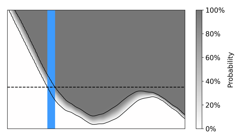
Of course, it would be even more preferable to have something a little less stochastic. After all, nine samples is not enough to characterize a distribution. The traditional solution is a credibility band. A credibility band is based on the idea that a lineout relates a series of known x-values with corresponding unknown y-values, meaning there’s a posterior distribution of possible y-values for each x-value.
From here, there are two main ways to construct a band. Either you draw a band that contains 90% of the lineouts in their entirety – a simultaneous credibility band – or you draw one that contains 90% of the lineouts at each x-value – a pointwise credibility band. I always use pointwise bands because they’re easier to calculate and they make my measurement look better. Simply calculate a credibility interval for the distribution at each x-value, and shade the resulting region.
In the case where the credibility band is equal-tailed, this is equivalent to considering the probability that a given point on the plot is above the true lineout, which can be plotted as a heatmap. The pointwise equal-tailed credibility band includes all points where that probability is between 5% and 95% (that is, it will include a given point if we’re not sure if it’s above or below the true lineout).
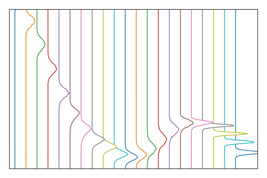
We can generalize the same idea to contours. It’s tempting to view the contours as a series of uncertain x-values and uncertain y-values.
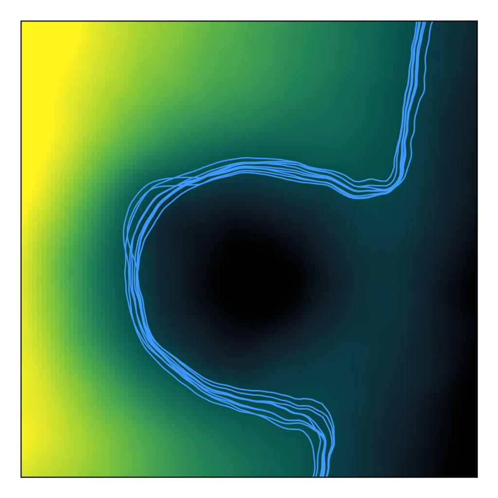
From this, given a reasonably well-behaved image, it’s relatively easy to construct a simultaneous credibility band. But it’s harder to see how one could construct a pointwise credibility band. Here I was inspired by this 2023 article in International Journal of Geographic Information Science by Tomáš Bayer and friends. They considered the precision of a geographic contour by looking at the contour at a slightly lower elevation, and at a slightly higher elevation. In other words, consider the relation between known x-values, known y-values, and unknown z-values.
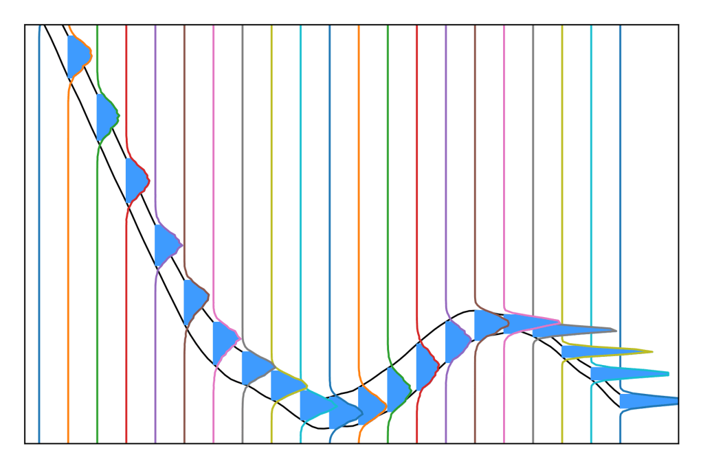
Then at each point, consider the probability that it’s above the contour level.

Then we call the credibility band the region where that’s between 5% and 95% (that is, where we’re not sure which side of the true contour it’s on).
The thickness of the contour at any point is suggestive of the uncertainty at that point, and can be thought of as the spacial resolution of the measurement.
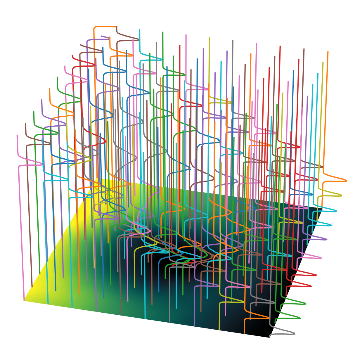
There’s an equivalent description here where you consider the 5th percentile image (the 5th percentile of the pixel value distribution at each point) and the 95th percentile image (the 95th percentile at each point). The bounds of the contour credibility band are actually the contour lines of those percentile images. This relationship can be seen by comparing the contour location to the lineout credibility band.
In practice I actually recommend calculating your contours using the 5th and 95th percentile images, rather than using the probability that each point is above the level. Even though they’re equivalent mathematically, the percentile images are more linear than the probability map, so will give more precise results with the implicitly linear interpolation used by most contour-finding algorithms. Basically, if you plot contour bands using the probability method, your bands will never be less than 0.9 pixels wide, even if your data is very precise.
If your data is clean enough, you can then plot a bunch of these things, just like any other contour plot.

As the old adage says, an image with uncertainty leaves a rainbow in its wake.

Interesting post! I’ve never seen the ‘thick contour’ approach you show here, but these kind of inferred 2- or 3-D probability distributions come up in seismic imaging. Here’s an example: https://academic.oup.com/gji/article/209/2/1337/3059633?login=false (fig. 4). Note they also look at the spatial patterns of covariance (fig. 9). Some models contain more than one variable (e.g. P- and S- wave speed) but I haven’t seen plots looking at the covariance between multiple spatial variables.
Oh, cool! I figured there must be other examples in other fields, but seismic imaging is not one I would have thought to look for.