Say you’re writing a scientific paper, and you need to plot the geographical prevalence of a gene. Or a snapshot of the phase-space particle density in a PIC simulation. Or the measured temperature along an array of thermocouples as a function of time. In such contexts, our ancestors have long turned to the humble pseudocolor (or heatmap). A pseudocolor is a plot that assigns a unique color to every value in some range, and then fills in a two-dimensional space such that the color at each point corresponds to the value of some quantity at that point.
The most subjective – and arguably the most important – part of this process the selection of the value-to-color mapping scheme (or colormap). Many authors are content to use the default colormaps of plotting libraries like Matplotlib, MATLAB, and GNU Plot. These defaults are often perfectly serviceable. I argue, however, that a more rigorous approach to colormaps allows you to convey your data much more clearly – a critical skill in any form of technical communication.
In this style guide, I lay out guidelines and suggestions that will help you design, choose, and use colormaps in a way that is easy to read, intuitive to interpret, and accessible to all.
Basic principles for sequential colormaps
Most pseudocolor plots use sequential colormaps (colormaps that range from zero to some positive value). There are five key criteria to keep in mind when working with these simple mappings: they should be monotonic in lightness, follow a simple hue progression, be perceptually uniform, have a neutral zero, and be used consistently. Keep in mind that these criteria are guidelines and not firm rules. Several of them also apply to other kinds of colormap, which will be discussed explicitly in the next section.
1. Monotonic lightness
A colormap should be monotonic in lightness. It may go in either direction (lightening or darkening) but it should never have peaks or valleys. Colormaps that meet this criterion are more or less inherently colorblind friendly, as everyone can perceive differences in lightness. In addition, it makes it easy for the reader to compare two colors; all they need to do is gauge which is lighter and which is darker (lightness is easier to distinguish than hue or saturation).
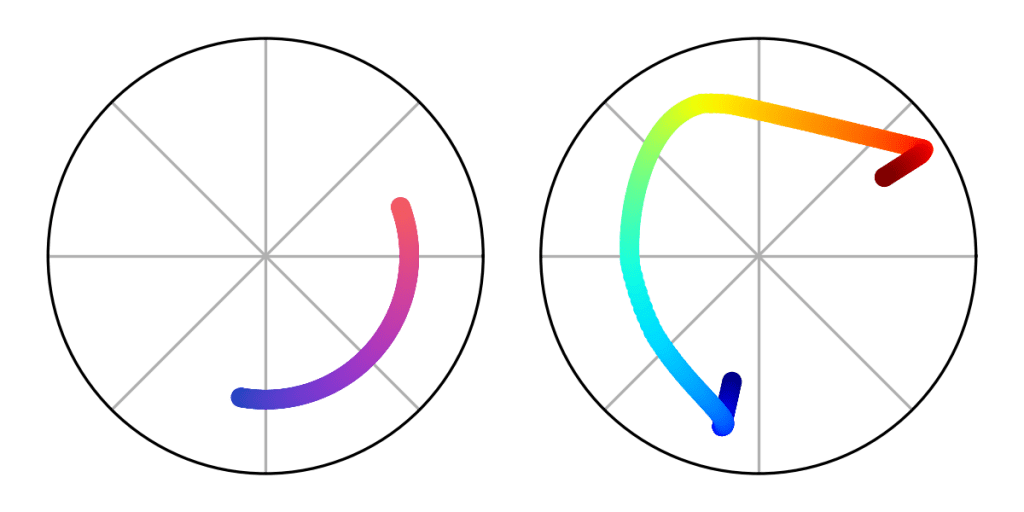
Jet, the former default colormap of MATLAB, is an excellent example of what not to do. Jet is a variation on the simple HSV rainbow colormap, an exceedingly popular style in many disciplines. Contrary to the principle of monotonic lightness, Jet is lightest at cyan and yellow. In addition to making plots nigh unreadable for those with some forms of colorblindness, this also draws disproportionate attention to the contours at those particular levels.

2. Simple hue progression
A colormap should not cover more than three hues (not counting black or white). Obviously Jet, with its five or six hues depending on how you count, fails this one too. Furthermore, the hues should appear in an intuitive order – using two hues that are adjacent in the rainbow almost always works. For example, a blue-purple-pink colormap rather than a black-red-blue-purple-gray-yellow-white colormap.
This may seem counterintuitive, since a multi-colored colormap makes small changes in value more apparent than a simpler one. The problem is, this sensitivity to small changes comes at the cost of readability of large changes. It’s hard for the reader to memorize a long sequence of hues, so they must re-consult the legend every time they see two colors next to each other to recall which is higher. If you are concerned about the perceptibility of faint details in your pseudocolors, consider adding contours at the relevant levels, adjusting the colormap limits, using a logarithmic scale, or subtracting out low-frequency components.
Logarithmic scales that cover many orders of magnitude are an exception. A field of 30 μT is, in some sense, not comparable to a field of 30 T, so it is not so important if the reader can to quickly assess the relationship between their corresponding colors. In such cases, in order to prevent your reader from drastically underestimating the significance of seemingly small difference in color, it is better to use at least one hue per order of magnitude.
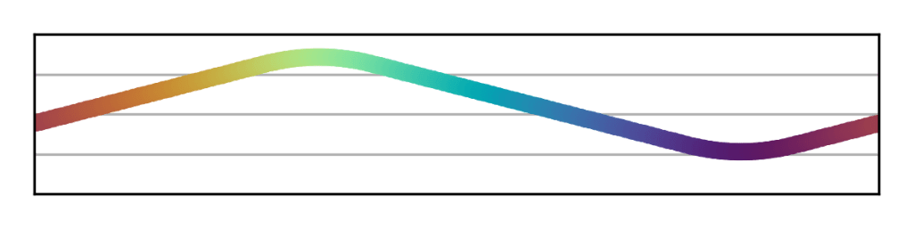
3. Perceptual uniformity
A colormap should be perceptually uniform, meaning that a given change in value always corresponds to the same perceptual difference in color. There are various mathematical formulas defining perceptual uniformity, but an easy way to test a given colormap is the “ripple test” shown below. Jet fails this test; a large range of different values in the teal region are perceptually very similar, making features in that area hard to make out. Conversely, nearby values in the orange region are perceptually very different, creating the illusion that features in that area are stronger than they really are.

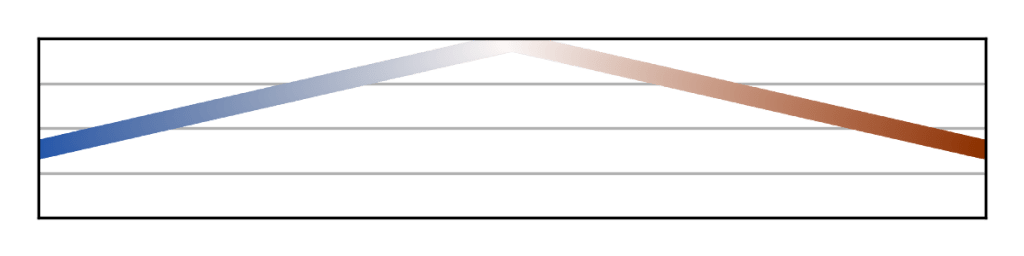
4. Neutral zero
When zero is represented on a colormap, it should be represented by black, gray, or white. The extreme values should be something more saturated. This helps your reader intuitively orient themself without having to consult the legend to see which way is up. Which neutral color you use should depend on the lightness direction of your colormap, which should be chosen based on the physical meaning of the quantity you’re plotting. This ties into the next criterion:
5. Consistent usage
Each colormap should only be used for a single quantity. Ideally, there should be a one-to-one mapping between quantities and colormaps. This makes it trivial for readers to tell when two heat maps are directly comparable and when they aren’t. When possible, the chosen colormap should also go with its respective quantity (reds and yellows for temperature, blues for humidity, and so on). A more comprehensive list of specific guidance is given further down.

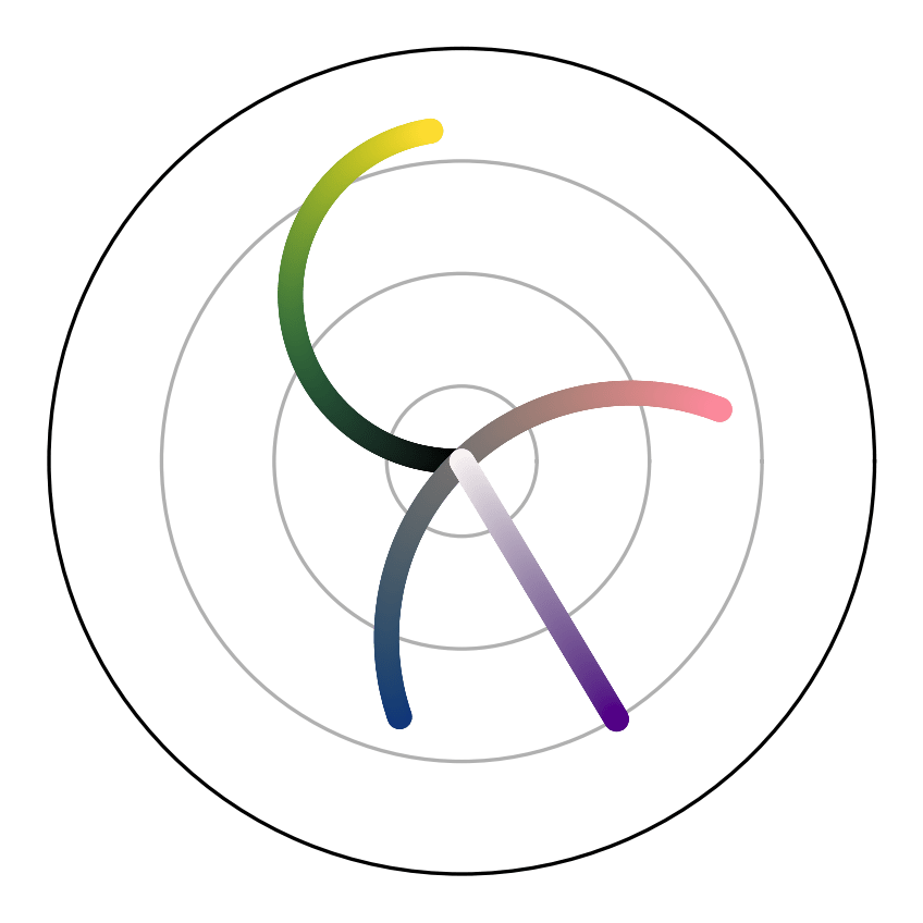
Extending to nonsequential colormaps
When plotting quantities that have both positive and negative values, it is sometimes a good idea to use a diverging colormap. A diverging colormap visually branches out in two directions from the middle. The most common way to make a diverging colormap is to stitch together two sequential colormaps that meet at white or black.
Because this technique creates colormaps that are not monotonic in lightness, this style should only be used in situations where the positive and negative regions are fairly contiguous, and avoided in situations with a lot of high-frequency noise. In addition, you should take special care to ensure the two branches have hues that can be distinguished by those with red-green colorblindness. The more accessible option is to make a sequential colormap with gray as the neutral zero, a dark color at one extreme, and a light color at teh other (for example, violet-gray-yellow), though this provides less contrast between zero and the extremes.
When plotting periodic quantities like angle and phase, it is essential to use a cyclic colormap. A cyclic colormap has no beginning or end; the same color is used for both the minimum and the maximum value. Because these are never monotonic in lightness, it is usually better to use a contour plot or streamline plot instead.
Specific color suggestions for various quantities
Here is a list of commonly plotted quantities, along with suggestions for what hues and which lightness direction to use for each one.
- Brightness, emission, transmission, albedo, irradiance, and reflectance should, naturally, be black-to-light. If the emission is visible light, then the maximum value should map to the hue of that light.
- Absorption, attenuation, and optical depth should be white-to-dark. Likewise, if the material doing the attenuating has a color, then that color should be used as the maximum value. If the material is a light color (for example, bone), then the lightness direction may be flipped.
- Concentration (including humidity) and density (mass, number, or probability) should also be white-to-dark unless the substance being described is light in color.
- Temperature should be black-to-light for things you touch (following the hues of a visibly glowing blackbody), or white-to-dark for weather (because ice and snow are white). For other contexts, it can go either way.
- Pressure is the product of temperature and density, and accordingly can go either way.
- Fluid velocity can go either direction, but the maximum value should always be a warm color since they are associated with activity while cool colors are associated with slowness.
- Electromagnetic field strengths should be black-to-light, the hue depending on what color fields are in your headcanon.
- Voltage should be black-to-light when the colormap only covers one sign (black should be ground and red or yellow should be hot), and blue-to-red when both positives and negatives are present (ground can be black, gray, or white).
- Amplitude should be black-to-light, by analogy with visible light waves.
- Wavelength and frequency can go either direction in lightness. Short wavelengths should correspond to cooler colors while long wavelengths should correspond to warmer colors (like visible light). Blue-green-yellow and yellow-orange-red are both excellent options.
- Particle energy may use the same colormaps as frequency, by analogy between particle radiation and electromagnetic radiation.
- Phase should be cyclic, unless only a limited range of phase angles is represented, in which case either direction and any hues will do.
- Chi-squared should be black-to-light, because it is the inverse of probability density (neglecting priors).
- Differences, political alignments, and anything else with both positive and negative values should use a diverging colormap.
- Altitude can tastefully be plotted on colormaps without a neutral zero, since sea level isn’t typically associated with either black or white. It’s not uncommon, or even bad practice, to use a discontinuous colormap when the plotted altitudes straddle sea level. Forest-beige-white is typical for above sea level (though this has been criticized for implying that low altitudes are always vegetated). Indigo-to-celeste or some variation thereof is essential for below sea level.
How to make colormaps
The easiest way to put all this guidance into practice is to use colormaps that other people have already created. If you use Matplotlib, there exist many good ones built-in that meet most or all of the criteria above (the documentation comprehensively details which are monotonic and which are perceptually uniform). If that doesn’t cut it, the Colorcet and cmocean Python packages supply a multitude of additional high-quality colormaps.
If you don’t use Python or, like me, simply prefer to micromanage your plot styles, you can use Viscm, the GUI tool published by the Matplotlib developers, to make your own. It allows you to easily design monotonic, perceptually uniform, sequential colormaps.
If you want even more fine control, you can always code up new colormaps yourself. The simplest technique is to draw a line, helix, or Bezier curve through the CIECAM02 Uniform Colorspace (UCS) and then project it into sRGB space. I do this in Python using the colorspacious package (this is also what Viscm does under the hood). CIECAM02-UCS is a three-dimensional colorspace defined with black at ⟨0, 0, 0⟩ and white at ⟨100, 0, 0⟩, and designed such that Euclidian distances in space correspond to perceptual differences in color. This means that a constant-speed path through it represents a perceptually uniform colormap. It’s technically not exact, but it’s as close as one can reasonably expect.
Conclusion
Colormaps are an often overlooked aspect of data visualization, but provide a powerful tool for authors to express their data more clearly and accurately. I’ve outlined several guidelines and suggestions for how to do just that, but as with everything in data visualization, remember that no one solution is the best for every situation. When making a pseudocolor plot, you must carefully consider what styling will help your reader understand the particular point you’re making, and follow or ignore these principles accordingly. I hope reading this guide has helped you understand some of the key considerations involved and enabled you to make all of your pseudocolors excellent.
